
262 posts
How To Do Extrafacial Expressions!
How to do “extra” facial expressions!
Drawing basic facial expressions is not the hardest. Most people can draw a sad face, a happy face, angry etc., but making more multidimensional expressions is more of a challenge. I have gotten a lot of compliments on how I draw facial expressions, (specifically “angsty ones”) telling me that they are very dramatic and well… expressive! And there are actually only a few things I think about when I draw faces that take them to the next level, so I thought i’d illustrate them all here!
SUPER IMPORTANT TIP BEFORE WE START: Look at your own face when you draw faces. Even making the face when you are drawing (you don’t even have to look at it), will give you some sense of how the face muscles pull and where things fold and stretch, because you can feel it. You are the best reference when it comes to facial expressions!
Angles
Draw the head in an angle that matches the expressions you want to make. It is not a requirement, but is going to add to the effect.

Symmetry vs asymmetry
A face is rarely symmetric. Unless the face the character is making is 100 % relaxed or even dissociating, the eyebrows, mouth and facial muscles will have different placements of their respective side. This image shows the dramatic impact asymmetry has on a face:

That’s the difference between a smile and a smirk!

The first one’s like “oh yeah?” and the second is like “oH YEAH??”
The “balloon squishing principle”
This is something I did subconsciously, and I didn’t know about until I made this tutorial. And this principle goes hand in hand with an asymmetric face. Basically, if you squish one part of the face, you need to even out the empty space by “inflating” the other part of the face so that it doesn’t appear shrunken. The picture hopefully explains it:

Teeth
Don’t forget to add the gum when the mouth is open to its full potential!

Squinting and folding
Adding folds around the eyes when a character is squinting makes a HUGE difference. It makes a smile more genuine and a growl more intimidating. Adding folds to the face in general makes your characters more lifelike and ‘visually relatable’. Like, they look human, and less plastic or fake.


and so on..
Pupils and irises
The placement of the iris and pupil in relation to the eyelids is very important! The less of the white you see, the more relaxed the character is.

And then of course eyebrows and eyes go hand in hand!


Gestures, spitting, sweating…
Adding more elements than just a face is key to making the character actually look like they are feeling what you want them to feel. Just the tiniest sweat drop adds to their anxiety, spitting adds frustration to their rage, slouching shoulders, waving hands, a double chin, extreme angles, the list goes on! Add whatever and see what kind of impact it makes! Does it do the trick? Great! Add it!
Over exaggeration!!
Remember that you can almost always exaggerate more. Don’t be afraid to do draw “too much” because you’re just experimenting. See what works and what doesn’t. What do you like to exaggerate?


Now that you know some theory, it’s time to practice!
Practicing!!
The 25 Essential Expressions (a classic! I’ve done it multiple times)

And the one I do when I’m bored:
Fill a page with circles and fill them in with different expressions. Try and exaggerate as much as you can!


This is mostly for experimenting. They are quicker to draw than complete faces, but the same rules should apply!
And that’s about it!
I don’t know if I covered everything in this tutorial, since some things might be obvious for me, and this post perhaps only scratches the surface. So feel free to send me a message if you want an explanation about something more in depth! Thank you for reading! And now DRAW!!! ✨🎨
-
 what-the-hell-mate liked this · 6 months ago
 -
 shalvis liked this · 6 months ago
 -
 winterblood liked this · 6 months ago
 -
 cynicalraccoon reblogged this · 6 months ago
 -
 thephantomwolfi3 liked this · 6 months ago
 -
 bookmarksjustforme reblogged this · 6 months ago
 -
 admiraltyofquivers liked this · 6 months ago
 -
 vanity-breaking reblogged this · 6 months ago
 -
vanity-breaking liked this · 6 months ago
-
 artisticcallycaffeinated reblogged this · 6 months ago
 -
 spaghetticat3899 reblogged this · 6 months ago
 -
spaghetticat3899 liked this · 6 months ago
-
 dogtorwd reblogged this · 6 months ago
 -
 sixdow liked this · 7 months ago
 -
 iishifishii liked this · 7 months ago
 -
 nirectile liked this · 7 months ago
 -
 algui3nwe0n liked this · 7 months ago
 -
 anabellatook-baggings liked this · 7 months ago
 -
 enot-eg liked this · 7 months ago
 -
 itriedimhighandreadytodie reblogged this · 7 months ago
 -
itriedimhighandreadytodie liked this · 7 months ago
-
 its-susume-clawthorne-whispers liked this · 7 months ago
 -
 notexactlyanartblog reblogged this · 7 months ago
 -
notexactlyanartblog liked this · 7 months ago
-
 queencantaloupe reblogged this · 7 months ago
 -
queencantaloupe liked this · 7 months ago
-
 mythicaldemonart reblogged this · 7 months ago
 -
mythicaldemonart liked this · 7 months ago
-
 circulartogetic liked this · 7 months ago
 -
 astrmastr liked this · 8 months ago
 -
 beneaththeiceandsnow reblogged this · 8 months ago
 -
 keisskinjling liked this · 8 months ago
 -
 aeryl liked this · 8 months ago
 -
 inkreal reblogged this · 8 months ago
 -
 7fragment reblogged this · 8 months ago
 -
7fragment liked this · 8 months ago
-
 catgirltoofies liked this · 8 months ago
 -
 sapphoseraphim reblogged this · 8 months ago
 -
sapphoseraphim liked this · 8 months ago
-
 luna-mistrunner reblogged this · 8 months ago
 -
 katagawajr liked this · 8 months ago
 -
 werewolfcave reblogged this · 8 months ago
 -
 snuggly-eve liked this · 8 months ago
 -
 sadbutbadboi reblogged this · 8 months ago
 -
 ruwubyrose liked this · 8 months ago
More Posts from Chikasartrefblog
PERSPECTIVE & WARPED PERSPECTIVE TUTORIALS with Samples
Before you start reading my tutorial, please consider helping out a dying artist. I created this tutorial in hoping to bring people to support my activity on Patreon. Guess what?! Nearly 10K notes and only +60 people decided to back me up. I have always been supportive to improvement of aspiring artists, people eager to learn and have never asked for a single dime. I’m in a verge of giving up art and go homeless for real and once in my life I beg internet to support me.
Support me on Patreon so I don’t have to quite art. MY PATREON PAGE –> www.patreon.com/toshinho
I give up, but thanks. Enjoy the tutorial and have a nice day.
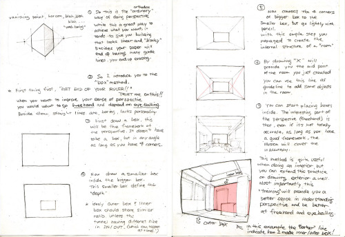
I’ve archived series of perspective & warped perspective tutorials that I made in the past with minor revisions and added samples. I believe some people have struggle with perspective probably because of the impression of complexity and the fancy terms that comes with it. I’ve met many artists that just didn’t want to deal with the all fancy terms like “3 point/4 point” perspective and walked away from it and I understand that feeling. Personally these terms are quite useless and that the important part of perspective drawing is really just capturing the dimension and getting use to it. (When I do perspective drawing I put very little consciousness in points & lines but towards how my brain is seeing the depth and dimension.)
When I first learned perspective drawing in elementary school art class, my teacher taught me the conventional method with ruler, lines and dots. While it provide accuracy, it tends to require alot of lines and wide space where your starting points existing way off the page and perhaps this might be the reason why some people find it tedious and hard to deal with. So I’m going to ditch using ruler and the fancy term and demonstrate them in much simpler approach.
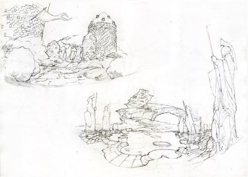
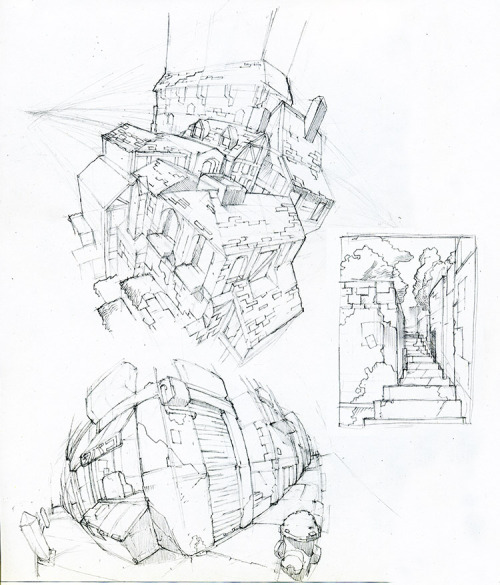
I purposely build these tutorials in raw pencil rather than the nice looking digital tutorials because I want to show you that it’s not about the precision and accuracy that makes convincing perspective but a daily scribble and eye-balling. Treat them like any other drawing practice, doing tons of freehand and eye-balling to grasp the dimension in your head. I wont stop you from making a use of a ruler, however perspective drawing is a vital practice to improve your line work as well. (Personally when I use a ruler, my perspective looses the sense of dynamics and objects would look too uniform. Besides clean straight lines has no personality and can look dull at times.)
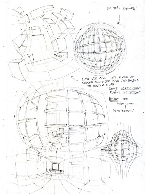
1 BOX - Method
The idea is that when drawing 2 squares with different size (having same or similar ratio) you have already managed to create an illusion of dimension. By connecting each corners with four lines you are dealing with perspective. The key to this practice is that you’re trying to place your consciousness on dimension and not towards drawing a nice looking box. Train your eye-balling by making use of the four extending lines from each corners to get the perspective line without the need of referencing the focal (center) point.
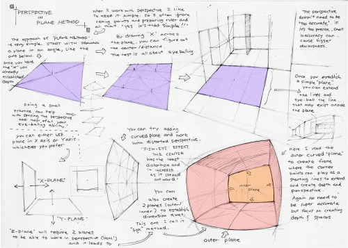
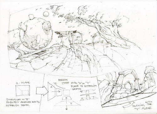
2 & 3 PLANE - Method (The lower portion of third image)
Basically it’s the reverse of conventional point based perspective. You’re not drawing from the point but towards the imaginary point. When you draw a square shape in an angle, you manage to create first step of illusion that suggest dimension, so this tutorial is trying to take advantage of that situation. (Tho it’s heavily dependent towards your EYE-BALLING SKILLS!)
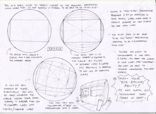
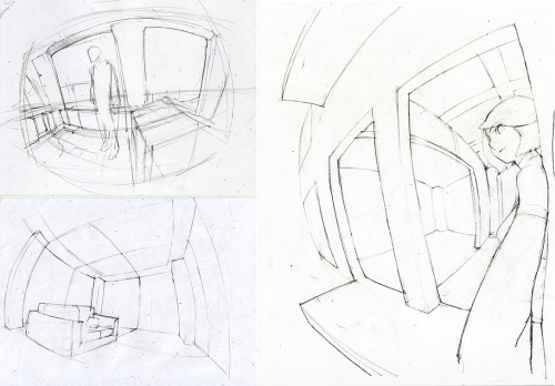
4 FISH - EYE TUTORIAL
This is pseudo “Fish-Eye” tutorial that is trying to simulate fish-eye lens on a camera. The idea is that the object close to the center has fewer distortion and will cause more distortion as it gets further towards the edge of the lens (sphere). I believe that warped perspective requires a bit of confidence in handling normal perspective drawing. More so the sense in eye balling is needed, so get use the normal perspective drawing first and then start mixing warped perspective into your practice.
My 2 cent is that rather than using a big space on an empty page/canvas, draw a frame and then start drawing. (You can see me do that on few of my samples.) This tip apply to general drawing as well since “big empty canvas” can be a bit intimidating. By setting a frame or a border, it’s actually you’re first attempt on creating an illusion in a 2D space.
My final note is that even though you’re doing a freehand, a sloppy lines will break the illusion, so pay attention to where the line starts, how it flow and where it ends.
Support me on Patreon so I can create more artworks and tutorials! MY PATREON PAGE –> www.patreon.com/toshinho
Attention anyone who needs hairstyle references
I want to introduce all of you to this amazing place called the ukhairdressers style gallery.
It’s basically a massive database full of high-quality images of different hairstyles. I mean, look at all the options in that sidebar (and part of it’s cut off):
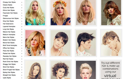
In total they have 976 pages of hairstyles with about 17 styles each, that’s about 16592 hairstyles to look at.
Look at all the stuff they’ve got! Long hair:

Short hair:

Straight hair:

Curly hair:

Afro hair:

Men’s hair:

Hair on older models:

Extra-fancy hair:

Even crazy avant-garde hair:
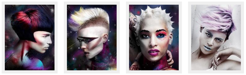
So if you need help with designing a character or you just want to practice drawing hair, this is a fantastic resource.

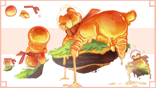
*(*´∀`*)☆ - How to draw honey/shiny stuff :
__________________
Quick step by step originally asked by @floatingmegane-san and @suke1234.( thanks for asking! )
i doesn’t really explain anythin’ but that’s how i do it !
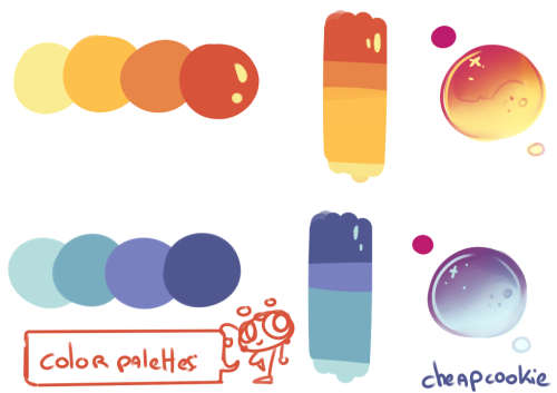
I added two quick color palettes and an exemple (a kind of honey bear made for school )
shading colour tips
hey yall its me the Art Mom™ to help you shade pretty
rule 1: DO NOT SHADE WITH BLACK. EVER. IT NEVER LOOKS GOOD.
red- shade with a slightly darker shade of purple
orange- slightly darker and more saturated shade of red
yellow- i think like..a peach could work but make it a really light peach
green- shade with darker and less saturated shade of blue or teal
blue- shade with purple
purple- a shade thats darker than the purple you’re using and maybe a little pink (MAYBE blue)
pink- darker shade of red
white- a really light lavender or blue..or i guess any really light colour??
black- okay listen dont use pure black to colour anything unless you want to leave it with flat colours because you cant really shade black lol
grey- a slightly darker shade of purple or blue (less saturated)
brown- slightly darker and less saturated shade of purple or red
aaaaand thats all i got lol. let me know if there is anything i should add to this list!!

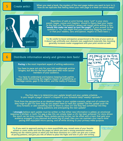

Get more writing practice and have fun doing it with ~the supplement~
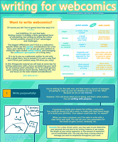
This tutorial contains tips about writing for webcomics, with my caveat that I’m not formally trained in any of this stuff~~ This is all just my personal observations and tips from the past 10 years of putting comics online, but they’ve served me pretty well so far! For some examples of this info applied to my own work, feel free to check out my webcomics at The Meek and Mare Internum.
All of my tutorials are released in lower-res format to the public 6 months after publication at the Shingworks Patreon. You can access the full tutorial archive, as well as nearly 1.5 years worth of bonus content, by becoming a Patron :] I just wrapped up a two part tutorial about building and launching Patreons, good times.
and thanks in advance for not removing my text <3