Hewo!! I Rlly Love Your Sans, Tear!! He's Such A Creative And Inspirational Character! Just Curious,
Hewo!! I rlly love your sans, Tear!! He's such a creative and inspirational character! Just curious, what were some of your inspirations, when designing him?
-vibrates in excitement- I will use this chance to yap A LOT about Tear's overall creation, story and visuals. I'm sorry for this essay…
______
I returned to the Undertale fandom super recently. It’s 8-9 years after the game was released I think. I started to joke with a friend how I will make an OC only now. 3 days later it was not a joke anymore and Tear came to be.
I think what influenced the story I created is the fact that I adore isekai, reincarnation and reliving same life kind of stories. I love the feeling of being able to experience what being a specific character is like, be it through my own eyes or another character's. Because a lot of people enjoy superpowers, want to feel cool, want to become important in something/story, want to see characters deal with this type of confusion etc.... Yes, I read Sans variant reincarnation/isekai stories too. I thought, who wouldn't be interested into experiencing an exciting life (minus the stress and trauma that comes with it, but that makes it a fun read).
In the moment of me joking about creating an OC, I was trying to come up with funny scenarios that would make me laugh from how absolutely ridiculous it is. It was only to have a few laughs with a friend. Revisiting the utmv fandom, it is pretty clear it's legit ruled by Sanses and barely anything else. Somehow the idea of using my favorite character, Napstablook, just clicked with my reincarnation/isekai addiction. A character that, just like all the people consuming the same content I liked, wishes to experience what they consider exciting. That is, the life all these Sanses have. They only ever saw Sanses be 'special'. I hoped it would make Tear relatable. That Tear would be a character which is entertaining to follow, because we know what the multiverse is like as viewers, but they do not. Someone who could be cheered on because of it (just like in the game wow -cough cough- sorry). And then the idea with ripping Error's plushies hit me. I was so overly entertained by it, that it was basically the point where the whole thing stopped being a joke.
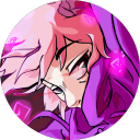
After I had the basis of the story to work with, I moved to designing their look. I pulled up a picture of every. single. popular. sans. variant. that I could remember from utmv early days. I wanted Tear to be able to legit fit in so well among them, because their wish was to be like them, blend with them in such a way. To be a Sans, a cool traveler to meet many others, be loved etc etc. For this plan, the design had to have not too much detail or too little. Most utmv designs aren't that complex. Napstablook only has a few visually distinctive features, so I tried to keep them in mind. Those being their line between the eyes and the sheet waves/frills at the end of their body. So the only initial plan was... sketch a normal sans, slap the usual shorts and shirt that all these OC variants barely change and figure it out from there. A lot of mainstream characters still wore a kind of a hoodie/jacket, so a hoodie was a must for me. I added the waves at the bottom of it, to resemble Napstablook's body, and that forehead line in the form of stitches. It still didn't feel enough. I wanted it to be extremely obvious who they are visually at first glance, with 0 prior knowledge (Napstablook Sans variant). Headphones were my biggest cherry on the top, because I don't think it gets more clear than that if I shape them to look like Blooky themselves. I later on decided I want some design references to Blooky crying too. So I added a scarf, made it drop it's ends approximately in the center of the character, as well as made the edges rounded slightly. All so it would resemble -drum rolls- a tear. Very, very subtly. The tear heart in the back was also a not so subtle tribute to it too. Because Blooky is fully paper white, Tear had to be mostly in the same colors. I admit I wanted to make their purples blue instead (to match their house colors) but I'm a sucker for the purple color and there is an inside joke with another friend how everything I ever design has some sort of purple tint to it. It's something I stopped fighting long ago and just embraced it as my little art quirk. At this point I adopt it on purpose if I catch myself doing it subconsciously. So my blue became purple instead. This was all inspired by OG Blooky and no one specific directly.
Once the design was already settled, I actually did end up taking inspiration from Dust Sans. This is the only character I directly took inspo from. I loved the idea of dramatic shadows being cast by his hood and it was perfect for what I have in store. So I expanded my ref sheet with such a drawing. I wanted the usual Tear to have a completely different vibe visually from the one that could be fought. I wanted to kill some of Tear's overall softness by making their gaze feel off. Wide eyed stare, with drastic shadows and glowing eyes. Tho they cannot and do not glow for the same reasons as Classic Sans. I recently mentioned it HERE. There is another inspiration I took from Dust, not connected to the design, but as of now I cannot mention it. It will be revealed soon if all works out.
After that, I just started writing the character info on the google doc and polishing it. The story just kept coming and consuming my brain. I never planned to make a comic out of this little idea. I was only gonna post Tear’s info sheet, maybe draw Tear 2-3 more times and move on. It was an impulse decision. All because I couldn’t stop chuckling about the Error bit and the consequences of it. Now Tear became somewhat of a comfort character and gave me a hyperfixation of a truck
-
 farceurcole liked this · 4 months ago
 -
 martyn-ogg reblogged this · 5 months ago
 -
 frouillonandmouguette liked this · 5 months ago
 -
 t3m1 liked this · 5 months ago
 -
 iamnotgoingtopostanything liked this · 5 months ago
 -
 sketchingstuff0 liked this · 5 months ago
 -
 danielpanels liked this · 5 months ago
 -
 clioseeker liked this · 5 months ago
 -
 mx-maddmcgeeky liked this · 5 months ago
 -
 1choclo liked this · 5 months ago
 -
 awa-the-skeleton liked this · 5 months ago
 -
 leilanising reblogged this · 6 months ago
 -
 leilanising-sideblog liked this · 6 months ago
 -
 gluttycotom01 liked this · 6 months ago
 -
 justanotherblogger liked this · 6 months ago
 -
 0p1er0 liked this · 6 months ago
 -
 dawnpool-works liked this · 6 months ago
 -
 glowing-squash reblogged this · 6 months ago
 -
glowing-squash liked this · 6 months ago
-
 artyc-stan-of-tsp liked this · 6 months ago
 -
 jamplayer liked this · 6 months ago
 -
 silverryu25 liked this · 6 months ago
 -
 neon-draws-sometimes reblogged this · 6 months ago
 -
neon-draws-sometimes liked this · 6 months ago
-
 eluxurex liked this · 6 months ago
 -
 zafirreja111 liked this · 6 months ago
 -
 toffeebrew reblogged this · 6 months ago
 -
toffeebrew liked this · 6 months ago
-
 cybereaper69 liked this · 6 months ago
 -
 caretaleandotherstuff liked this · 6 months ago
 -
 unamzi liked this · 6 months ago
 -
 corruptinmyself liked this · 6 months ago
More Posts from Eriscary
I met you on a discord server, in a Vc actually! And now i found your blog! Keep up the good work <3 -your neighborhood rainbow🌈
Hehe I recognized you back from your art and very colorful signature. It was super cool getting to meet you that day ^^ (ur PNGtuber is so pretty istg) also tysmmm and right back at you too <333
What's Tear's heigth compare to others shorts sans like Swap and Ink?
In the past, I made Tear be 4'0", but I'm changing it to 3'10". This does make Tear taller than Ink and Swap still.
My reasoning behind the change is... Tear had to eyeball Sanses height so the chances of getting it right are slim. I think it just adds a little more to the story and the change is so small. Classic Sans has no game canon height and everyone has their own take on that, so I will just state that his height is 4'0" in Tear's original AU.
Tear also appears smaller in the comic because UF Papyrus they encounter (and UF Sans) are both taller than their Classic/UT selves. This of course only applies to the AU variant Tear fell into. I like to believe heights can change based on AU variants.
Very curious to know if Tear has a "Sans eye" and if so what color it is
And if he doesn't, would that be something that gives him away?
Tear doesn't have a 'Sans eye', but his eyelights reflect light. Meaning they glow in the dark similar to cats.
It would depend on the individual if Tear's eyes count as a giveaway. There are Sans variants without one (killer(if not stage one), horror(the eye technically isn't his), error etc.). Tear's biggest visual giveaway is their own plush body, as the place they live at isn't inhibited with plush variants.

MAMAS MAKIN A VIDEO
Oh my gosh, Tear looks so baby. Gonna get that cuteness aggression. sdgfsgdsfgdfgdf. Even though u sent another ask right after saying no video in the end, I just wanna say this is amazing regardless and has all my love. Just this small bit is so -mwah- I MEAN LOOK AT THEM. lil potat. really, thank u ;w;

I was unable to draw for a week due to some personal health bs and a job. But I don't like keeping u guys waiting for things too much, so here is a non-spoilery sneak peak from the comic. My thumbnails VS sketch. Next update is 3 pages yet again. It cuts too awkwardly otherwise. I think I will also be posting art stages of one of the next new comic updates. By which I mean... thumbnail, sketch, lineart, color and shading phase. I thought it might be cool to show. I may or may not have started animating Tear dancing too.