
🌸 Bethany Bronwyn Curtis 🌸 Illustrator 🌸 Side Blog 🌸 Commissions Open 🌸 Shop
764 posts
Mooooore Inktober, Running Out Of Things To Say


mooooore inktober, running out of things to say
Inktober days 19 -27
Pinterest Board
-
 argonthestablesciencekiddo liked this · 7 years ago
 -
 tetramodal liked this · 7 years ago
More Posts from Firbetmakes

The first simple postcard I painted for my summer project. Decided to draw a simple design based of a pattern I'm painting on a model I'm painting.


Inktober: Day 26 - 27 - 28 Compilation
(26) “Skelecat”
(27) “Green Dragon”
(28) “Gem Dragon”
I wanted to draw another cat this time so I drew them as if they had painted themselves like a skeleton. I wanted to tryout a new silver pen I bought, however it does not show up very well on the scan. I think silver pens don’t come out very well except on black paper compared to gold pens.
I wanted to try out drawing dragons in some different style however it is very hard to get the balance of body structure and scales right on the dragon. I think on this drawing I made the scales to small and his body too long so he just comes out really weird looking ;).
On my second attempt I think it went much better however I still need to do a lot of practice to get the hang of it. I think having a better reference really helped me with drawing this dragon. If I where to refine this design in photoshop I think it would turn out pretty well.


Inktober: Day 23 - 24 - 25 Compilation
(23) “Sleeping Book Dragon”
(24) “Clean Dragon”
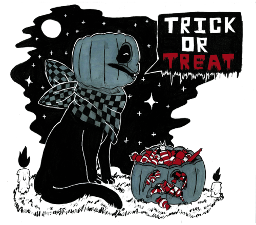
(25) “Trick Or Treat”
For my sleeping dragon I only recently looked up how to blend with promarkers that I have had for years, it was much easier than I first thought. I think the blending looks really good on his hide as I had so many variations of red in my box however I don’t know whether blending with other colours will be as successful.
For my clean dragon I wanted to use the new winsor and newton pigment markers that I recently got. On normal paper the markers barely blend so I layered these up however I was hampered because of the lack of verity of colours so I did have to compromise on quite a few things like the colour of the toothpaste.
I wanted to draw another pumpkin cat as my last one I thought was some of my best work. This time I wanted to draw the night sky behind and try and make a more sinister look about him so I did some spot colouring. I still want to try out a few more positions with this character so I may go back to them.


Inktober: Day 20 - 21 - 22 Compilation
(20) “Pumpkin Cat”
(21) “Fateful Encounter”
(22) “Witches House”
For my pumpkin cat I wanted to try out another new style this time I went for a more monochrome bold style that uses white lines in-between the background and character to create a larger contrast. I really like this look and so far this has been my favourite drawing. I’m so proud of it.
I used a similar technique on my next drawing but this time I used it on a scene. I like how it turned out especially how the black background doesn’t encompass all of the cobblestone path and how the cobblestone path has a strange perspective on it.
On my last drawing I got a bit stressed so this was my way of reliving some of it. I used a brush pen and a white gel pen to create a very expressive set of brush strokes. I think that the scene looks okay but if I wanted to use this again I will have to develop the style some more.


Inktober: Day 14 - 15 - 16 Compilation
Now for my next set of 3 late inktober drawings.
(16) “Apprentices Kitten”
(15) “Teacher Cat”
(14) “Witches Stolen Robes”
With my Kitten I wanted to try and make them look really fluffy, I think I need to practice some more. But I like hoe it’s positioned and what colours I used. On this drawing I wanted to combine crosshatching however because I used an alcohol fine marker the ink blended with the coloured marker :(, won’t make that mistake again.
My teachers cat was a test to try out some coloured highlighting with some green highlights from the green cauldron. I think it worked however I do have practice some more with the size and place of the highlights. The vibrant colours are good but I need to figure out how to get rid of streaks.
For my stolen robes I wanted to try out some clothing and fabric. I wanted to use some soft colour shading on the clothes which I think worked however I have to work on how long the shadows in the fabric was.