Comparrison Of Art Using A Photograph Vs. A Phone Scanner


Comparrison of art using a photograph vs. a phone scanner
-
 monathemothslayer liked this · 7 years ago
 -
 stormthestorm liked this · 7 years ago
More Posts from Missritafarr
Sick of Tumblr blocking your posts in search because they have external links to your portfolio, patreon, twitter or whatever? Yeah me too.
But there’s a way around it!
FIRST > Edit / customise your theme (the desktop version, aka the actual HTML and CSS junk) Find this button:

Add your page like you would for other pages! Except on the drop down select “Redirect”!

The insert on the right is what will appear on the preview side on the right. Here I’ve put in my twitter! Fill it out and give the page URL something lowercase and easy to remember (like /twitter)
Post your stuff how you would normally. Unfortunately using the bottom left ‘source url’ button on the image as usual itself still gets censored (seriously fuck you Tumblr what the fuck).

Link your sites as you would normally EXCEPT we use the tumblr link (for me it’s the above!). If you use a domain name, you WILL need to use your tumblr URL rather than yourname.com/redirect ! This will link people to my twitter but still show up in /tagged/ and /search/

Your stuff will now should show up! This doesn’t seem to work for editing older posts but I haven’t tested that out fully.
And lastly
Fuck you tumblr
Love, Lycisca.
do u have any tips on how to paint that fluorescent skin effect??
sorry im not quite sure what you mean but im assuming youre talking about the rainbow shit
i dont know all the art terms so bear with me
to add to this post, i start by just putting some random colours down then blending them out. for trolls i use lots of green blue and purple cos i guess my ocular cones n rods tell me cool colours are closer to grey than warm ones are

then i pick a colour for the high points and blend out with adjacent colours to get that rainbow effect
yellow is a good colour cos you can blend from yellow to red or yellow to blue and it will look nice + allow you to include lots of different colours which adds to the holographic/iridescent/whatever effect and still give an impression of depth without having to add heaps of black and muddying up the colours

you dont have to use yellow though, i just reckon its the easiest jumping off point. below i just changed the hue in photoshop n got cyan. it still looks like its got depth and all that but now are colours are limited, we missing yellow and orange. try different shit out though. pink is nice too

these are like fairly bad pics but below are some ways to do this with yellow as the colour of your high point/bits where the most light is bouncing off
think of the arrow going from the highest to lowest points. i like doing it the way i have in the middle pic cos i reckon its a bit more fun and dynamic. but yeah dont limit yourself to yellow! plenty of other colours out there in the big wide world. and dont worry if it looks garish you can always edit it later on

anyway you dont have to think too long and hard about like colour order or anything though. the main thing is just putting the right colours next to one another, so if youve got a green patch and a red patch blend them together with some yellow, orange/red goes between yellow and purple, etc etc
sometimes its better not to plan things too much

I was gonna post the completed version of this here but im never gonna finish it so accept the scraps

Doing face practice and it looks kinda terrifying
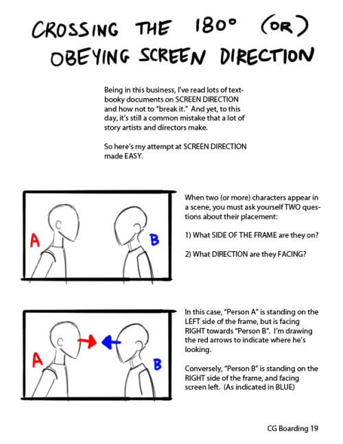
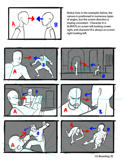

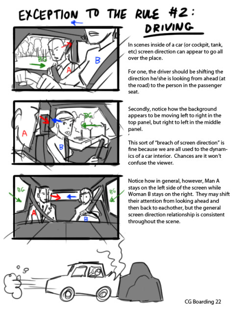

Hey kids! If you’re a filmmaker, animator, or storyboard artist and you don’t know what screen direction is, you might want to read this.
For the record, there are always exceptions to the rule in filmmaking, which is why I pointed out 3 examples here.
I’ve also found that comic books tend to NOT take screen direction as seriously as film does, but I’m still on the fence if this is wise or not. My favorite comics pay close attention to screen direction so as to not confuse the reader.
Good luck!
