Side-blog managed by someone who tends to stack resource and tutorial posts under her blogs' drafts as future references for anything useful in life. Circa 2014. REOPENED.
230 posts
Tutorial: Expressions~
Tutorial: Expressions~
First off, I gotta start off with the typical Disclaimer.
*ahem*
This is a tutorial based off of MY knowledge and MY experience. My advice is just that, advice, and is not is anyway, shape or form, absolute. I am still learning and do not consider myself a professional or expert. Look at other sources, look at other materials, expand your inspiration, don’t just look at this tutorial and call it good. And most importantly have fun~
Alright, with that out of the way, before I can get to the actual expressions, we need to discuss an important concept known as “Squash and Stretch.” You’ve probably heard of it before. Squash and Stretch was a method that was invented (I use this term a bit loosely) by Freddie Moore, a Disney animator from the 1930s to 1940s. He was the animator for the Dwarves in Snow White and he gave these characters a spongy flexibility that made them feel more real and gave pliability to the face that made them come more alive.

Even outside the world of animation, Squash and Stretch is essential and you’re going to squeeze much more life out of your characters if you understand and are willing to push the weight and flexibility of their faces. This also doesn’t only apply to cartoons, look in the mirror and make funny faces and strange expressions and you’ll notice how squishy your face is.
The next concept to be aware of is the Acting Elements of the Face. This is a concept I never really thought about until I read Tom Bancroft’s Character Mentor, a book I have recommended many times. The Acting Elements are the basics of character expression and focuses on breaking down the elements of the face in order of importance to properly communicate an expression to the audience. These are not set in stone and a lot of times their order can be switched around depending on the expression. This is the default order Bancroft uses in his book:
1) The eyes
2) The eyebrows
3) The mouth
4) The neck
5) The nose
I’m not going to go into much detail about this; otherwise this tutorial will run on forever, so DEFINITELY give Character Mentor a look for a better understanding.
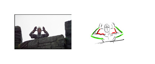
Here are some expressions I whipped up, notice the different ways each of the above elements contributes to the overall expression. Try to identify which element is strongest in each one. Also notice how some elements repeat (such as the use of the eyebrows in the bottom two) but they’re still different expressions.

I personally find that I always build from the eyes out when building an expression. Ever heard the phrase “The eyes are the windows to the soul?” well guess what? THE EYES ARE THE WINDOWS TO THE SOUL! This is why people look away when their embarrassed, why their gaze shifts when they’re lying, why their eyes grow wide in awe. It’s what makes a hero seem cold when they hold their gaze at the display of heartless behavior or gives a villain a moment of redemption when they turn away from a cruelty.
Part of the reason why Glen Keane’s characters are so incredible is the way he expresses a character through their eyes. He says “If you’re going to make a mistake, don’t make it in the eyes. Because everybody’s looking at the eyes.” He creates these characters that are filled with passion and before that passion translates into body language or into an expression, if bursts out through the eyes.


Remember when I brought up that the order of the Acting Elements is flexible? As I said, I tend to start with the eyes when expressing and character but sometimes that just doesn’t “work” with the character. Take a look a Max, from Cats Don’t Dance (if you haven’t seen the film, I highly recommend it, even if just for the animation). His face is almost ALWAYS in the same position, with the same expression, completely stiff. The only thing that moves is his mouth and it’s animated in a way that is both comical and intimidating! This is a common theme with his character, fluid motion against unmoving bulk. It contrasts and guess what? Contrast creates interest! <——Remember this phrase, because it applies to everything!

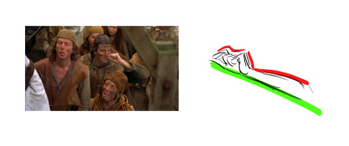
Next, pushing your expressions. Don’t be afraid to add that extra “umph” to a characters expression. Unless you’re animating, you don’t have the luxury of constant motion and steady frames, so make the most of a scene, make it clear to your audience what your character is feeling. Check out some of these simple examples below.

Now some of you probably thought the first expression was better than the second. And you know, you may be right! Sometimes a subtler expression speaks volumes more than a more obvious one. It’s important, however, to understand to how to make the most use of your character’s face. But in the end it all boils down to the character. Which leads me to my final segment of this tutorial…
A character should express themselves through their emotions. Just like costumes, colors, body language, etc. expressions are ultimately a tool used describe a character, to visually tell a story about them. When dealing with different characters, try to avoid “recycling” expressions, ESPECIALLY in the same scene/picture/moment. A good exercise is to draw two or three different characters with the same emotion but give them different expressions.
Or better yet, draw them reacting to the same situation.

Your goal should be to make each expression true to the character. Their expressions should tell the audience something about them. The same way you might bold a word or phrase to emphasize its meaning, a character should express themselves in ways that emphasize who they are.
-
 mai-fanblog liked this · 8 months ago
 -
 artking-4 reblogged this · 8 months ago
 -
 dee1dee6 liked this · 8 months ago
 -
 geist19 liked this · 9 months ago
 -
 wolfsskull liked this · 10 months ago
 -
 yeloo777 liked this · 10 months ago
 -
 theuniversetraveler liked this · 10 months ago
 -
 abirdie liked this · 10 months ago
 -
 elusever liked this · 11 months ago
 -
 ask-odile reblogged this · 11 months ago
 -
 espieprinceofrefs reblogged this · 11 months ago
 -
 mains-angeliques liked this · 11 months ago
 -
 ygodmyy20 liked this · 11 months ago
 -
 quartz26x liked this · 11 months ago
 -
 clearflowerprunealmond liked this · 1 year ago
 -
 onionrimgs liked this · 1 year ago
 -
 polorizetheoryreblogs reblogged this · 1 year ago
 -
 nogurlstoy liked this · 1 year ago
 -
 katiewolfgirl7 liked this · 1 year ago
 -
 axolkitkat reblogged this · 1 year ago
 -
axolkitkat liked this · 1 year ago
-
 spookyminecraftpotato reblogged this · 1 year ago
 -
 cepheusgalaxy reblogged this · 1 year ago
 -
cepheusgalaxy liked this · 1 year ago
-
 asmolvaporeon reblogged this · 1 year ago
 -
 tree-of-olives reblogged this · 1 year ago
 -
 raginggoose06 reblogged this · 1 year ago
 -
raginggoose06 liked this · 1 year ago
-
 infotohelpout reblogged this · 1 year ago
 -
 idril-fay liked this · 1 year ago
 -
 brookpeirsunset liked this · 1 year ago
 -
 dizzydreamerzzz reblogged this · 1 year ago
 -
artking-4 reblogged this · 1 year ago
-
 twadi-gurl reblogged this · 1 year ago
 -
artking-4 reblogged this · 1 year ago
-
 darradreamer reblogged this · 1 year ago
 -
 beaker-artref reblogged this · 1 year ago
 -
 starrylibraryofresources reblogged this · 1 year ago
 -
 cryptic-insomniac liked this · 1 year ago
 -
 mechanical-v1scera liked this · 1 year ago
 -
 arlyiahshay reblogged this · 1 year ago
 -
arlyiahshay liked this · 1 year ago
-
 shinypenguinpizza reblogged this · 1 year ago
 -
shinypenguinpizza liked this · 1 year ago
-
 puyo-b0rger reblogged this · 1 year ago
 -
 randomwizard21 liked this · 1 year ago
 -
 august--and-everything-after liked this · 1 year ago
 -
 matix524 reblogged this · 1 year ago
 -
matix524 liked this · 1 year ago
-
 haru-mushro0m liked this · 1 year ago
More Posts from Starrylibraryofresources
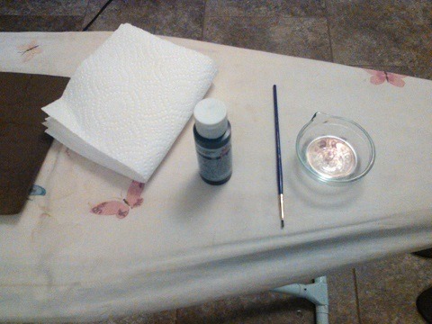
Foam to Leather (Tutorial)
Things you’ll need:
Brown craft foam
Aluminum foil
Clothes iron
Ironing board
Black paint
Brown paint (lighter than your foam)
Paint brush
Paper towel
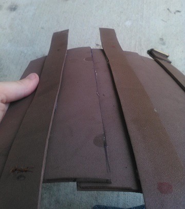
Grab some aluminum foil and crumble it into a ball. Not too tight of a ball though! The next step is almost impossible if you do.
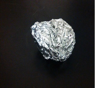
Next, un-crumple the ball. Flatten it out into one layer. It’s fine if there are a few holes.

Place it on top of your foam.
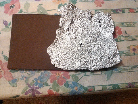
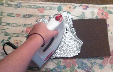
Take your iron and firmly press it on the foam and aluminum. My iron was set to 3 (polyester) but the correct temperature may be different for other irons. Just remember not to use steam! Before doing this on a large piece, be sure to experiment and figure out what the best temperature and what the best pressure is. On larger pieces, you’ll have to move the aluminum around a lot. It’s not a quick process.
Now you’ve got this crinkly affect on the foam. Next is painting!
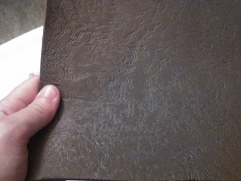
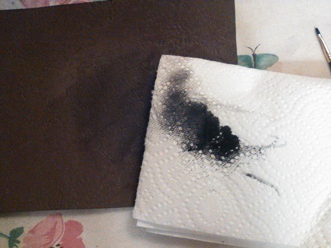
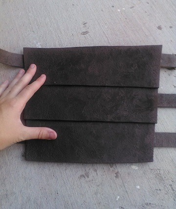
Grab you’re brush, black paint, and a dish with some water. The idea is to dilute the black paint enough so that when you apply it the paint will seep into the divets the aluminum created.
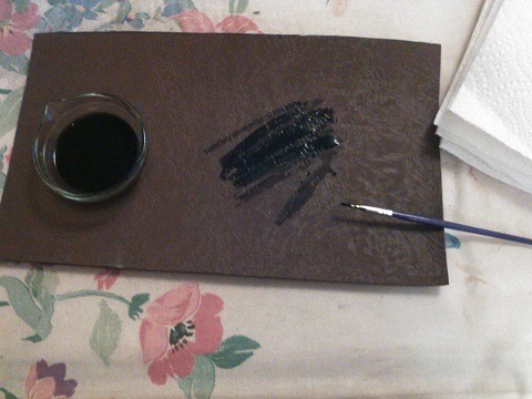
Once the watery paint is applied, wipe it off with a paper towel. Continue to do this for your whole piece of foam.
Now here’s an optional step (of which I haven’t done myself but I’ve known others who have):
Grab the light brown paint and, without diluting it, paint it on. It’s best to use a coarse brush in this case and to try to keep it out of the divets. Wipe some of the paint off.
Remember, imperfections are always good! Uneven paint isn’t necessarily bad so just experiment with it.
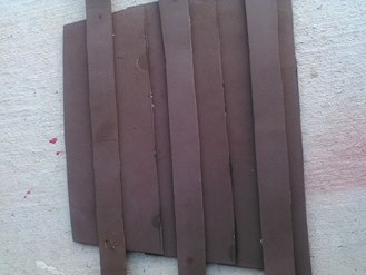
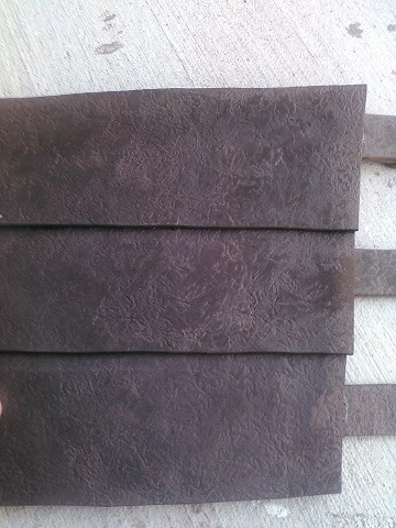
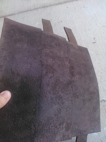
Here’s an example of a bracer I did with this method. The first two pictures are an example of the foam I began with and the rest show the end result. I hope this helps you guys out!
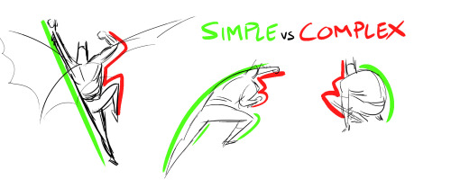
Last night, Paul Mendoza and I spoke to our animation class about the concept of “Simple vs Complex,” and I thought some of you might find this useful. The idea is to balance a strong pose by contrasting simple and contrast forms. The simple (stretching) side of a pose is usually your main line of action, while the complex (squashing) side is where you get most of the interest and the focal points of the pose. “Simple vs Complex” also works for individual parts like a flexing arm or a hand pose. This concept enhances clarity, appeal, and energy in any pose.
Bruce Timm’s style illustrates this concept best, but great actors (like the Python troupe) display this kind of posing all the time.
Have at it!
Inactive artblog is inactive. So have another tutorial. This one circling around halftones/screentones. There’s a million ways to do this, but I’m just showing you guys the way I use most.
Prepping art. Treat your tonework the same as you would treat your colored work in photoshop on a separate layer from your lineart. You should do perfectly fine using 1-2 layers just on tone work.

Make sure you work in grayscale. You’ll tell from the later steps if you are or aren’t. And you can’t change if afterwards else it’ll cause a moire effect.

Much like you would with color work, select with the magic wand area. This case, I selected the hair. I expand my select area to make sure I don’t have a awkward halo effect in the grays. Expanding 1-2 pixels works fine.

Fill in the area with grays. The Darker the grays the the darker the tone.

The pixelate window is where will be doing the majority of tone work. The two options used the most is “Color Halftone” and “Mezzotint” Will go into halftone first.

In the halftone window you can choose the size and dot angle. The “Max. Radius” section you can change and control how fine your tonework can be. Larger the number, larger your dots. Screen angles I usually leave alone. After you decide on a radius, hit okay.

Tumblr does a great job making that work look like it’s for nothing so just click here for a full view.
Now For Mezzotint

Doing the same steps above, I fill with grays. You can do this on the same layer with no problem. Or you can choose to use a separate layer for each effect.


This time going into mezzotint we’ve have a list a chooses. Each one does have nice tone results so I would check them all out. I’ll just stick with “Fine dots” to make a noise texture.

Full View
For the most part, that’s it. You can do the same thing with patterns, gradients and images or you can invert (cmd+i/ctrl+i) for invert tones. While it’s true you could download patterns to do the same thing, some patterns might be of low resolution and won’t give you the look you want personally.
Hello gamers, local disabled cane user is gonna teach you how to design a cane.
Tl:dr: design a cane based on comfortability and the disability of the character
First things first, you need to know why you’re character needs a cane. Do they have chronic pain? Unhealed injury? Muscle or joint issues? Do they have poor blood circulation which makes them dizzy? Do they need the cane all the time or does their disability fluctuate? Do they use a wheelchair or a walker sometimes?
There’s a lot you should know about a characters ability/disability in order to find what type of mobility aid they should be using.
There are a bunch of different kinds of canes/crutches. The 4 on the left are crutches. The difference between canes and crutches are, crutches are meant to keep weight off your legs as much as possible, and generally you use a crutch on each arm. Canes are used for stability and you usually only use one. Folding canes are great for people who only use their cane sometimes

Great! You’ve picked either a cane or crutches for your character. I’m done right? WRONG. Cane handles.
This is probably the most important part of canes because if you have the wrong handle your wrist will die.

I gently kiss all the canes on the left, they are all very good for grip and wrist, although the middle left is designed for left or right hand so you cannot switch hands with it.
The ones on the right are also pretty good, they wouldn’t be my first choice but they are still great. The top one is also very good as it has a wristband so you can’t drop it as easily. (Trust me when I say I DROP MY CANE SO MUCH)
Sigh. The middle cane handles… the bottom one I have never actually seen but it looks like it would kill my wrist. The top one is uncomfortable for long period uses, but it is good for if you’re a shepherd. And the pimp cane… the knob cane… it’s awful. Just no. It’s hard to grip, it is unstable it’s bad it’s awful I throw it into a fire. Please don’t give your character, they don’t deserve that pain
Now you know the basic ergonomic things, there are different shafts for canes and crutches

You can really get creative with this type of thing, just as long as it looks stable enough.
Here are some good examples of pretty canes that are ergonomic and good to use! (featuring victor arcane who i adore)


Add some cute details to the cane if you want! You can add stickers, colours, grip support. And while I love the concept of cane swords those are very unstable, if you want a cane weapon you can make it lead weighted, put knives in it. A poison vile in the shaft. Be creative.
Just some of these components are important to consider with a disabled character. There’s a lot more to consider with wheelchairs and walkers which I don’t have the experience with.
If you do have any questions my asks are always open to questions about this stuff! I’d love to help if you’re making a disabled character.

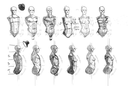

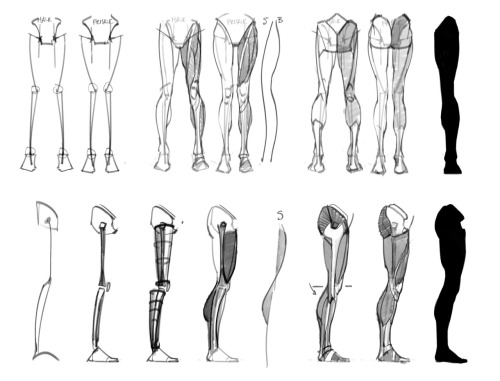
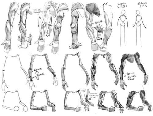
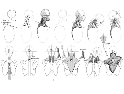
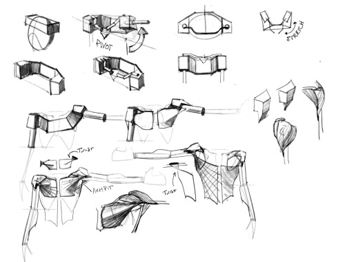
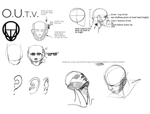
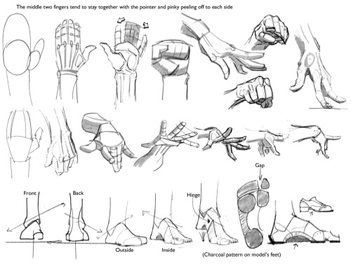
Some building block references my Life Drawing teacher drew up for us for our Figure Drawing class. Thought I would impart the wisdom.