Side-blog managed by someone who tends to stack resource and tutorial posts under her blogs' drafts as future references for anything useful in life. Circa 2014. REOPENED.
230 posts
Hello Gamers, Local Disabled Cane User Is Gonna Teach You How To Design A Cane.
Hello gamers, local disabled cane user is gonna teach you how to design a cane.
Tl:dr: design a cane based on comfortability and the disability of the character
First things first, you need to know why you’re character needs a cane. Do they have chronic pain? Unhealed injury? Muscle or joint issues? Do they have poor blood circulation which makes them dizzy? Do they need the cane all the time or does their disability fluctuate? Do they use a wheelchair or a walker sometimes?
There’s a lot you should know about a characters ability/disability in order to find what type of mobility aid they should be using.
There are a bunch of different kinds of canes/crutches. The 4 on the left are crutches. The difference between canes and crutches are, crutches are meant to keep weight off your legs as much as possible, and generally you use a crutch on each arm. Canes are used for stability and you usually only use one. Folding canes are great for people who only use their cane sometimes

Great! You’ve picked either a cane or crutches for your character. I’m done right? WRONG. Cane handles.
This is probably the most important part of canes because if you have the wrong handle your wrist will die.

I gently kiss all the canes on the left, they are all very good for grip and wrist, although the middle left is designed for left or right hand so you cannot switch hands with it.
The ones on the right are also pretty good, they wouldn’t be my first choice but they are still great. The top one is also very good as it has a wristband so you can’t drop it as easily. (Trust me when I say I DROP MY CANE SO MUCH)
Sigh. The middle cane handles… the bottom one I have never actually seen but it looks like it would kill my wrist. The top one is uncomfortable for long period uses, but it is good for if you’re a shepherd. And the pimp cane… the knob cane… it’s awful. Just no. It’s hard to grip, it is unstable it’s bad it’s awful I throw it into a fire. Please don’t give your character, they don’t deserve that pain
Now you know the basic ergonomic things, there are different shafts for canes and crutches

You can really get creative with this type of thing, just as long as it looks stable enough.
Here are some good examples of pretty canes that are ergonomic and good to use! (featuring victor arcane who i adore)


Add some cute details to the cane if you want! You can add stickers, colours, grip support. And while I love the concept of cane swords those are very unstable, if you want a cane weapon you can make it lead weighted, put knives in it. A poison vile in the shaft. Be creative.
Just some of these components are important to consider with a disabled character. There’s a lot more to consider with wheelchairs and walkers which I don’t have the experience with.
If you do have any questions my asks are always open to questions about this stuff! I’d love to help if you’re making a disabled character.
-
 theinkyfrog liked this · 8 months ago
 -
 smellslikeoranges liked this · 8 months ago
 -
 kyubiscale reblogged this · 8 months ago
 -
 raythefool liked this · 8 months ago
 -
 artking-4 reblogged this · 8 months ago
 -
 xilaxena liked this · 8 months ago
 -
 frolickingfogthing liked this · 8 months ago
 -
 nureyev-steel-institute reblogged this · 8 months ago
 -
 totallynotgayforyou reblogged this · 8 months ago
 -
 bluberimufim liked this · 8 months ago
 -
 the-moth-from-elsewhere reblogged this · 8 months ago
 -
the-moth-from-elsewhere liked this · 8 months ago
-
 catboyizuru reblogged this · 8 months ago
 -
 of-snow-and-sea liked this · 8 months ago
 -
 rhinco reblogged this · 8 months ago
 -
 lordcatwich reblogged this · 8 months ago
 -
lordcatwich liked this · 8 months ago
-
 itriedimhighandreadytodie reblogged this · 8 months ago
 -
itriedimhighandreadytodie liked this · 8 months ago
-
 p1nkwitch reblogged this · 8 months ago
 -
 secretlyhuntokar liked this · 8 months ago
 -
 reminerva reblogged this · 8 months ago
 -
reminerva reblogged this · 8 months ago
-
reminerva liked this · 8 months ago
-
 cinnamon-does-wacky-shit reblogged this · 8 months ago
 -
 themaskofreason liked this · 8 months ago
 -
 darrensomft liked this · 8 months ago
 -
 theaethernetconnection reblogged this · 8 months ago
 -
 anon1mity liked this · 8 months ago
 -
 mac-cheez reblogged this · 8 months ago
 -
mac-cheez liked this · 8 months ago
-
 araccoonthatlikesmurder reblogged this · 8 months ago
 -
 brieflie liked this · 8 months ago
 -
 aroace-nut-case liked this · 8 months ago
 -
aroace-nut-case reblogged this · 8 months ago
-
 gender-void-partially-stars reblogged this · 8 months ago
 -
 shy-sapphic-ace reblogged this · 8 months ago
 -
 vang0bus reblogged this · 8 months ago
 -
vang0bus liked this · 8 months ago
-
 that-one-musicalnerd reblogged this · 8 months ago
 -
that-one-musicalnerd liked this · 8 months ago
-
 behemothman reblogged this · 8 months ago
 -
 urlocalsupermarketofendocrinosis reblogged this · 8 months ago
 -
 spider-strawberry liked this · 8 months ago
 -
 calicoboy liked this · 8 months ago
 -
 kklunaflower123-normal liked this · 8 months ago
 -
 the-pest1lence liked this · 8 months ago
 -
 gamelpar liked this · 8 months ago
More Posts from Starrylibraryofresources


i just found myself using this random trick that one of my art professors taught me and i thought other people might like it!
other tips: -at rest, the elbow hits the bottom of the ribcage, and the wrist hits the bottom of the crotch -the distance from your inner elbow to your wrist is about the same length as your foot -the length of your hand (from wrist to the tip of your middle finger) is about the same length as the distance between the bottom of your chin and your hairline
so, if you have a feeling that proportions are wrong on something, those work as quick gauges. like, if a character’s forearm looks too long, try to visualize their foot being the same size and see if that works. if the hands look too big, look at their size in relation to the face.
hope this helps someone!
Inactive artblog is inactive. So have another tutorial. This one circling around halftones/screentones. There’s a million ways to do this, but I’m just showing you guys the way I use most.
Prepping art. Treat your tonework the same as you would treat your colored work in photoshop on a separate layer from your lineart. You should do perfectly fine using 1-2 layers just on tone work.

Make sure you work in grayscale. You’ll tell from the later steps if you are or aren’t. And you can’t change if afterwards else it’ll cause a moire effect.

Much like you would with color work, select with the magic wand area. This case, I selected the hair. I expand my select area to make sure I don’t have a awkward halo effect in the grays. Expanding 1-2 pixels works fine.

Fill in the area with grays. The Darker the grays the the darker the tone.

The pixelate window is where will be doing the majority of tone work. The two options used the most is “Color Halftone” and “Mezzotint” Will go into halftone first.

In the halftone window you can choose the size and dot angle. The “Max. Radius” section you can change and control how fine your tonework can be. Larger the number, larger your dots. Screen angles I usually leave alone. After you decide on a radius, hit okay.

Tumblr does a great job making that work look like it’s for nothing so just click here for a full view.
Now For Mezzotint

Doing the same steps above, I fill with grays. You can do this on the same layer with no problem. Or you can choose to use a separate layer for each effect.


This time going into mezzotint we’ve have a list a chooses. Each one does have nice tone results so I would check them all out. I’ll just stick with “Fine dots” to make a noise texture.

Full View
For the most part, that’s it. You can do the same thing with patterns, gradients and images or you can invert (cmd+i/ctrl+i) for invert tones. While it’s true you could download patterns to do the same thing, some patterns might be of low resolution and won’t give you the look you want personally.
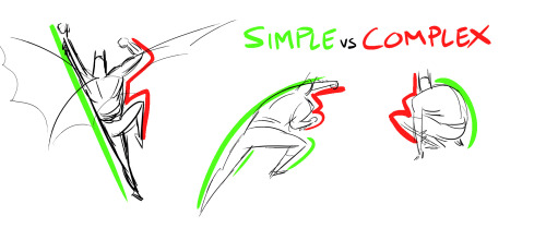
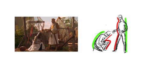
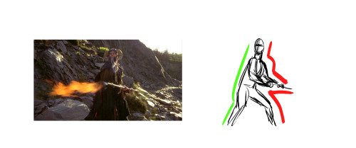
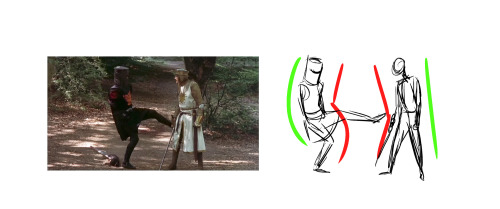
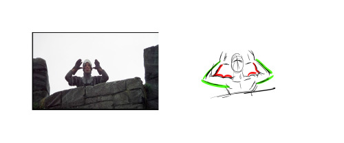
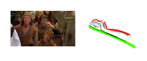
Last night, Paul Mendoza and I spoke to our animation class about the concept of “Simple vs Complex,” and I thought some of you might find this useful. The idea is to balance a strong pose by contrasting simple and contrast forms. The simple (stretching) side of a pose is usually your main line of action, while the complex (squashing) side is where you get most of the interest and the focal points of the pose. “Simple vs Complex” also works for individual parts like a flexing arm or a hand pose. This concept enhances clarity, appeal, and energy in any pose.
Bruce Timm’s style illustrates this concept best, but great actors (like the Python troupe) display this kind of posing all the time.
Have at it!


My art tutorial on how to get the sparkle effect on FireAlpaca! You can also use different shapes and different colours!
Let me know if this is helpful and feel free to send me links on the art you made!