Side-blog managed by someone who tends to stack resource and tutorial posts under her blogs' drafts as future references for anything useful in life. Circa 2014. REOPENED.
230 posts
Stumbled Across Your Art Recently, And I Totally Admire Your Work! As A Complete Noob To The Digital
Stumbled across your art recently, and I totally admire your work! As a complete noob to the digital art scene, I'd just like to ask whether you have any tips on colour picking (like for skin tones, under varied/dramatic lighting and such!). I have a ton of other things I want to ask, but I'll limit myself to one question and then try to google the rest, haha/ Thanks for sharing your art with us! ^^
ahh thank you so much! ♥ welcome to the digial art scene friend, i hope you enjoy your stay and ctrl + z
now onto your question! (if you don’t know what layer and layer modes are and how they generally work you should probably google that before you continue reading)
we all perceive colour differently (thx science) and i trust my intuition a lot when it comes to colour picking because of that, and also because i feel like you can make pretty much every colour combination work within the right context. context is key! but still, remember that all of this is about how i perceive colour, so you might not agree with everything i say.

here’s a quick rundown of terms you’ll see around a lot in reference to colours and shading: the hue, which is the ‘colour’ itself, the saturation aka the intensity, and the brightness [or value] which describes how dark or bright we perceive a colour to be.
rule of thumb: when you shade don’t just add black (or white) to your base colours, that will make your drawings boring and lifeless. use different hues and saturation!
now first things first: which skin colour does the character have?

you’ll mostly be navigating in the red to yellow spectrum for the skin tone. so when i pick the base colours i usually start with the skin and adjust the rest of the colours accordingly. if you’re not sure where to begin it might help if you first determine the values (brightness) of the base colours in grayscale.
and here are a few colour variations—i stuck to the approximate values but played around with a lot of different hues and levels of saturation.
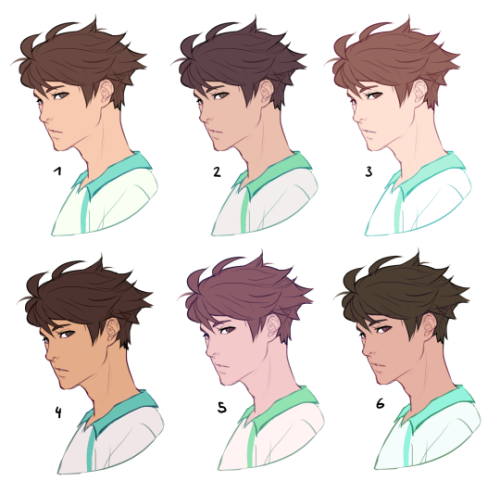
now compare 3 and 5: you’ll notice that 3 is very bright and leans towards orange hues, whereas 5 has a pinkish tint.

on the left i gave 5 the hair colour of 3 and in my opinion the pink hue of the skin doesn’t go well with the orange undertone of the hair. you’ll have to experiment a lot to find out which combinations work for you.
ctrl + u is your biggest friend (or image >> adjustments >> hue/saturation in photoshop, the shortcut works in sai and clip studio paint too). play with the sliders and see what happens. i do that a lot myself, because it’s easier to coordinate the colours like that afterwards instead of trying to manually pick perfectly matching ones right away.
for further adjustments i like to use an extra semi-transparent layer on top of everything with just a single colour to add atmospheric light. this unifies the colours and makes them more harmonious, if that’s what you’re looking for. this is about as far as i’d go if i didn’t want to shade the drawing.

if i do want to shade, especially with high contrasts and dramatic light, i darken the base by just adding an additional black layer, here set to 40% opacity. of course you could add a colour layer like the ones i mentioned previously too.


to create an impression of dramatic light you need a high contrast between light and dark areas (1). if i want additional visual intrest i often add secondary light which falls onto the main shadow areas. here i picked a faint greenish blue to balance out the yellow (2). and since light is at least partially reflected when it hits a surface you should add a faint glow that goes across the shadow/light border. i uses a mid-brown with a very soft brush on a layer set to overlay here (3).
for this shading style i like to use the layer mode colour dodge with lowered opacity + fill settings. for some layer modes opacity and fill do the exact same thing (e.g. for multiply or screen). however for colour dodge there’s a big difference:

a lowered opacity merely alters the transparency of the entire layer. that looks pretty awful sometimes, because the bright orange affects the dark of the hair much more intensely than the already brighter skin. but when you lower the fill percentage you primarily lower the amount of light that falls onto darker colours. so the layer’s opacity setting treats every colour equally whereas the fill setting takes their values into consideration. it might be hard to understand if you don’t try it out yourself, so just play around to get a feel for how it works!
and to summarise, here’s a process gif:

colour is an extremely big topic and i’ve only barely scratched the surface but i hope that still helped you out a little! the fastest way to learn is always to try things yourself, so grab a sketch and experiment. 👍
-
 blankcreator liked this · 1 year ago
 -
 carrotscatsandbristolboards reblogged this · 1 year ago
 -
 carrot-cat17 liked this · 1 year ago
 -
 bloblin-draws liked this · 1 year ago
 -
 onionowlwatchingu reblogged this · 1 year ago
 -
onionowlwatchingu liked this · 1 year ago
-
 themostefficientwaywithwater reblogged this · 1 year ago
 -
themostefficientwaywithwater liked this · 1 year ago
-
 mummelthecryptid liked this · 1 year ago
 -
 just-another-colin-kinnie liked this · 1 year ago
 -
 polishedgnome reblogged this · 1 year ago
 -
 eissibee reblogged this · 1 year ago
 -
 apaleblueflower liked this · 1 year ago
 -
 silvia-parra liked this · 1 year ago
 -
 spectacledartist liked this · 1 year ago
 -
 aikakyu liked this · 1 year ago
 -
 linaangelhearth liked this · 1 year ago
 -
 tobuzzu liked this · 1 year ago
 -
 heartfullofleeches liked this · 1 year ago
 -
 the-letter-horror-lover liked this · 1 year ago
 -
 mar-chive reblogged this · 1 year ago
 -
 wolfsskull liked this · 1 year ago
 -
 akemery8 liked this · 1 year ago
 -
 abirdie liked this · 1 year ago
 -
 shakychameleon reblogged this · 1 year ago
 -
 sirascolat liked this · 1 year ago
 -
 luisaxxrt reblogged this · 1 year ago
 -
arekisanderu liked this · 1 year ago
-
 neteruaida reblogged this · 1 year ago
 -
 kietakunai liked this · 1 year ago
 -
 magicfox3 liked this · 1 year ago
 -
 twadi-gurl reblogged this · 1 year ago
 -
 ette-lette reblogged this · 1 year ago
 -
 inennathedummy reblogged this · 1 year ago
 -
inennathedummy liked this · 1 year ago
-
 dontfindmeimscared liked this · 1 year ago
 -
 namida713 liked this · 1 year ago
 -
 the-voidkin-playground reblogged this · 1 year ago
 -
the-voidkin-playground liked this · 1 year ago
-
 rainbowut reblogged this · 1 year ago
 -
 lost-immortality liked this · 1 year ago
 -
 or13m liked this · 1 year ago
 -
 kuvvydraws reblogged this · 1 year ago
 -
 mogwaei liked this · 1 year ago
 -
 acerambutan liked this · 1 year ago
 -
 livingfailure liked this · 1 year ago
 -
 dav1sley liked this · 1 year ago
 -
 petricorah liked this · 1 year ago
More Posts from Starrylibraryofresources
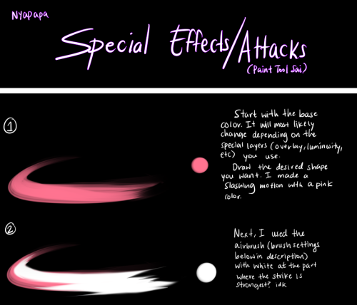
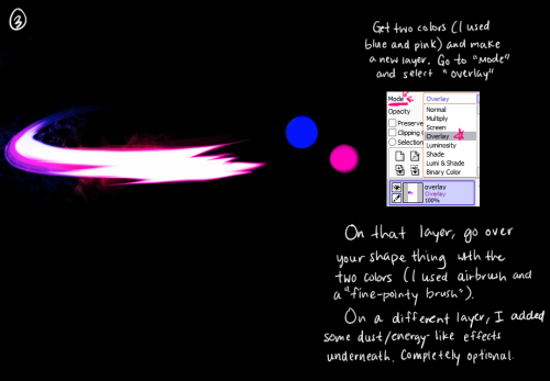
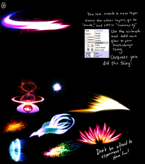
Click me for the brushes used in the tutorial A few peeps were wondering how I drew attacks in my nuzlocke comic, so I made a quick/kinda sloppy tutorial about it! Tbh it’s just me spamming luminosity and overlay layers haha ;yyy Hope this somewhat helps!
Do you think you could make a tutorial on how you made the gems in your Steven Universe background?
Here’s a quick thing I put together, I’m not great at in depth explaining so this tutorial assumes you have basic knowledge of layers and clipping groups and layer modes and all that mess.
HERE WE GO
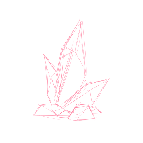
If you need to grab a ref do so, but sketch a common shape of whateves of your choosing.
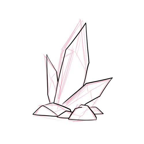
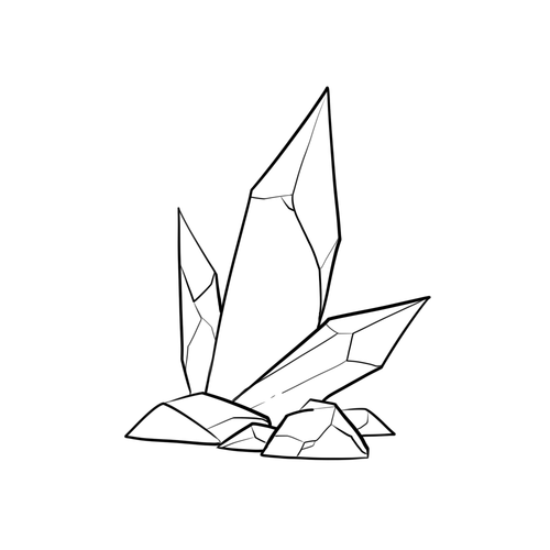
Grab your favorite inking brush or pen and get the outline going, thinner lines for the inside. Then kick your sketch layer to the curb. We don’t need it any longer.
Preserve the opacity of your ink layers and add colors if you want, maybe a few and blend them a bit for sparkle.

Make a new layer for your base color then just like your lines add a few likely colors and smudge things around blend them really nicely to your heart’s greatest desire.
Make another layer over everything but your inks and set it to luminosity or what ever your program’s name for it is. Grab a marker brush or something painterly like and make highlights.
You can either use the same layer or make a new lumi layer, get a soft brush and make soft light shade within for that magical feeling. Adjust opacity as desired.
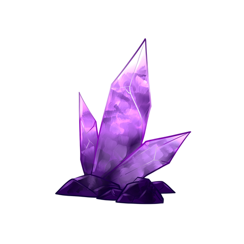
Make a multiply layer under your lumi layer and grab a painterly brush, maybe one with bristles/flat middle/ whatever you like and make a kinda broken/fractured effect inside with a darker color, do the same in one of your lumi layers or make a new one with the same brush and a lighter color, be sure to blend stuff around to make it look nice.
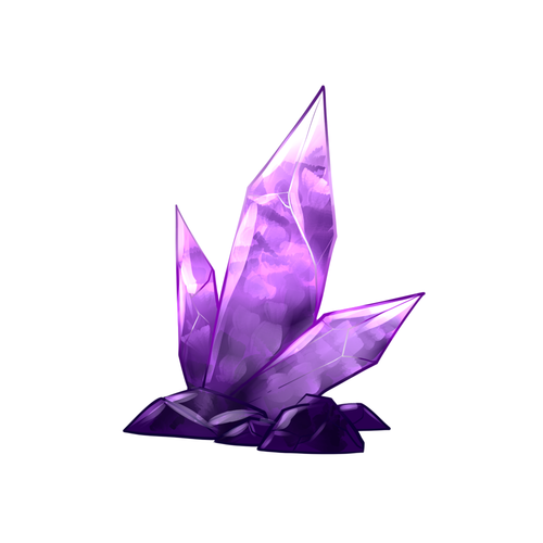
Add more highlights, preferably over the line work so more LUMI LAYERS. make sure your inner lines can be seen somehow.
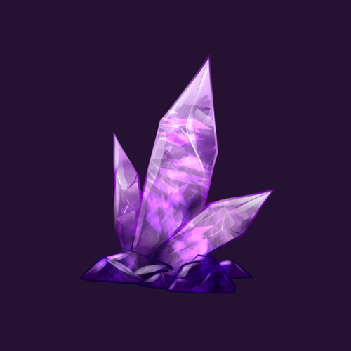
This is the part where I switched programs (was using Sai) you can do this in Photoshop or whatever you have that enables custom brushes.
I’m using Clip Studio Paint now and here I discovered that it has a broken glass like brush, they are very easy to find for PS users as well and THEY ARE NOT REQUIRED you can make them all by hand if you want, I just added a few strokes on top of my half assed ones to make it look great. Make sure you do a little blending as well.
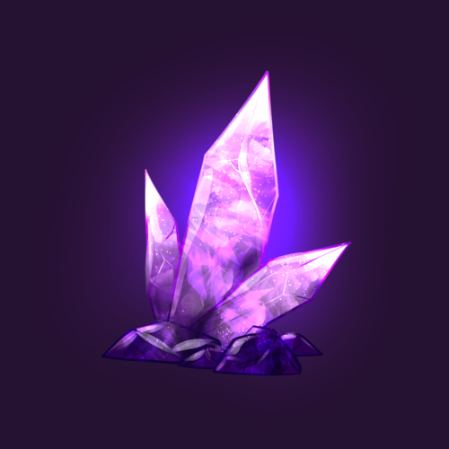
Add some nice glow behind the crystal and sparkles within the crystal.
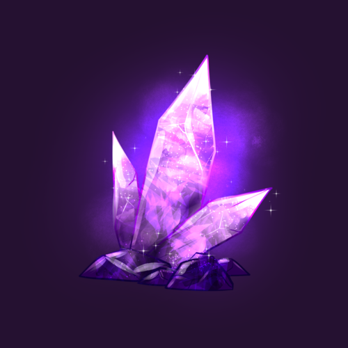
Optional but maybe texture your light a bit with a texture brush of your choosing, add more sparkles and you’re done.
I’m a bad teacher but this is how I make my crystals for the time being as I’m always finding new ways to do something better. But this is how I do it and you can always find your own way that works for you. c: Play around with your settings, do what works for you.


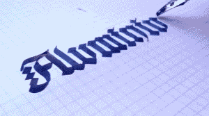
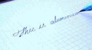
DIY Aluminium Calligraphy Pen

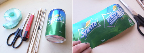
You’ll need tape, scissors, knife, disposable chopsticks, empty aluminium can, stapler and ink.
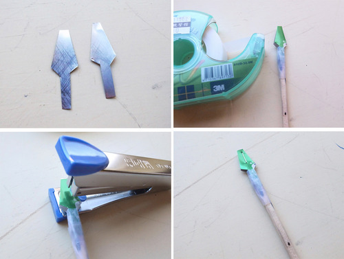
Calligraphy Pen for Gothic: cut the aluminium into two pieces like above and tape it on chopstick, then Staple the aluminium.
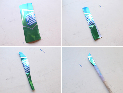
Medium Point Calligraphy Pen: Fold a piece of aluminim, and cut it like picture above. Then tape it on chopstick.
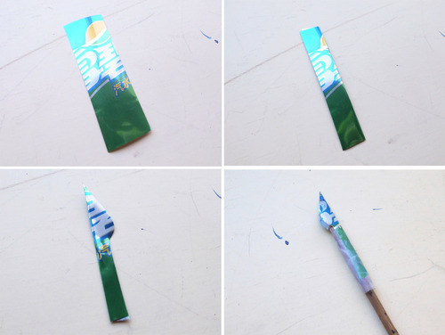
Fine Point Calligraphy Pen: Fold a piece of aluminim, and cut it like picture above. Then tape it on chopstick.
Now enjoy it :)


☞Turning straw into pen.