
They/them - AroaceLego MOCs and photography with a wide range of different characters and environments, every Wednesday (in theory-)
63 posts
Clone Wars Diorama !

✨Clone wars diorama !✨
Another one, technically the largest I have posted (yet~), featuring the 212th and a (placeholder) Jedi.
Of course, closeups and additional details below !
Views from directly in front/above :


Before I continue, I must confess it. This horrendous mistake, which you might spot by paying close attention to the right part of the image.
Yes. I somehow created an offset on the entirety of the wall’s height.
Overall, I’m quite happy with this one, mostly the environment, which turned out great (except for the offset….). What I’m not really sure leases with are the cheap AT-RTs from the battle packs, which are too bulky, but it works well enough for the moment, and since I’m not exposing to any connoisseur, it does the job.
Most of the minifigs are from these battle packs too, except for the Jedi, which is actually a savage oppress with a cloak, but every time I try to just remove the minifig, it feels like something is missing. The paratrooper captain has the hold grey kama and pauldron which always work well, even if it could have done with an additional visor.
Anyway, let’s get going with the closeups !
AT-RT scenes :


On the left, an engineer (my favorite kind of clone) fixing a broken down leg, with the help of one of the pilots. It was hard to get the minfigs in a 'lively' position, and the photo doesn’t render it correctly. The small white backpack is a piece I’ve stolen from the 501st specialist pack, because it’s nice.
On the right, a paratrooper with a completely inaccurate rocket launcher (the clone wars’ ones don’t look as cool, though). I quite like the way this part came together, even if it’s just a small detail.
Explosion scene :


I’ll admit it’s my first try with building explosions, and I’ll hopefully improve.
On the right, the clone says hi ! Well. No. He doesn’t, but it’s what he looks like on the photo, which I funny, I’ll admit, but not the image I wanted to convey, even if technically he’s set properly, as a projectile caused by the explosion.
The picture on the right convey the feeling of movement much better, with the clone shooting on the left, the others running along, and the paras being blown.
Other scenes :


The focus on the left is the droid ! I really like how it’s sprawled over that rock. Other droids can be found in the diorama, notably one being crushed by the rocket launcher AT-RT, partially under a rock, and part of one in the explosion.
On the right, we see a paratrooper down (but still fighting !) with, at his side, a medic applying a hypo. While it’s hard to see with this picture, he has a pouch at his side, and some chroma-black legs, because I was missing a pair of legs the medic has prosthetic legs, isn’t that awesome and convenient ? That is a lesson to learn, any lack can become lore ! Well, kind of. It’s what I also did with the Kashyyk MOC : I was missing all but the helmet of my ninth minifig, so I turned it into a grave of the missing squad member.
-
 bricktoygrapher liked this · 6 months ago
 -
 rachelamorph reblogged this · 6 months ago
 -
 rachelamorph54 reblogged this · 6 months ago
 -
rachelamorph liked this · 6 months ago
-
 andbkabdjabfjabcjs liked this · 8 months ago
More Posts from Enteroctopusdarkysilis
What are we
Boop
That is a very boop question.


✨Custom bionicle (again) !✨
Two more from my Ru-Fahi series !
Details and rambling below !
Jaller Ru-Fahi


…Because I couldn’t not include him. Realistically, all Toa Mahri a good to some extent, but this is peak Toa material right here. One of the first I acquired, one of the best looking ones, too. The base body is practically the same as the original, with some twists, but I mostly made him thicker and upgraded his sword, which is better with a guard and a proper handle. Well, that, and the Hannah, obviously. Sure, the original one was cute, but here me out :


Look at it, and behold ! It might be slightly bigger than the original, have only four legs, and need a larger chain (which I found just earlier in a box of misc Hero Factory pieces, and is better than a basic Lego chain), but doesn’t it look very cute and wholesome and dangerous ? Also, I gave it actual joints, because it deserves it, and removed the Kordak blaster because it didn’t need it anymore. I really love making arthropods with bionicle (I have more for later~).
Pohatu Ru-Fahi


Definitely looks awesome. The original is Pohatu Phantoka from the Rockoh T3 set (because I have one and a half of this set). It is the coolest version of Pohatu (because orange>brown, obviously). Lot of modifications on that one, from the custom jet pack to the arms and the legs. The arc pieces for the front arms are more or less of placeholders because I was niece a good piece to make the arms larger, but it turned out alright. The blades are also stolen from the half Rockoh, and the piece underneath, if anyone recognises it, is from Pohatu Nuva, because it’s a neat reference. And the tube is somehow remaining in the Kanohi, despot the fact that there is not any proper connection for it tand hold onto.

Also, can we talk about this leg ? If you ignore how incredibly illegal this whole piece is (ball joint stuck by the light grey part and small black and grey piece not completely connected to the rest), I think that’s the best shape I managed to get so far, and it reflects nicely what I have envisioned (Pohatu being able to run/jump easily because of the shape). And, it had the added advantage of fitting perfectly with the orange piece above when the knee bends.
Last but not least, I also have started a potential candidate for Toa of air, despite a lack of proper Kanohi, even with my extensive collection. My first candidate would have been Lewa Phantoka from the Axalara T9, but this one has a special place in my heart, so won’t be touching it and it will proudly remain in his shelf (along with the untouched Pohatu). So, maybe another of this series soon ! But probably not. And if I miss posting custom bionicle too much, I have a (complete) collection of entirely custom Toa, but I’m afraid they won’t fit in my studio (they’re big, too big).
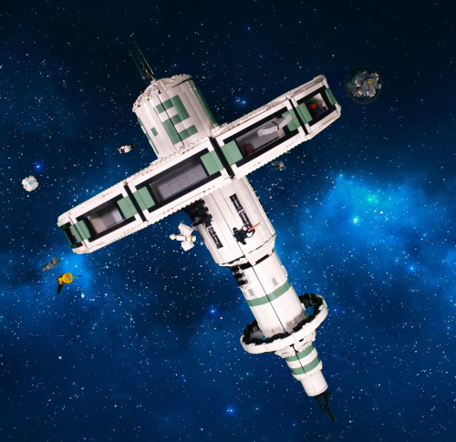
✨Trade Space Station !✨
[1/4] >Next>
Finally...More than 60 hours of work, I can present my masterpiece. I have been working and planning this project for a long time. Given the sheer amount of things to talk about, I will split all of my rambling in (at least) four posts : one about the concepts, ideas, and general aspect (you're here !); one about the technical side of things; one depicting how the project evolved (using pictures taken during the construction); and one dealing with all the smaller details, ships, and such.
Enough with planning, though. Explanations, other images and more explanations below the cut !
(less) edited picture of the build :

So. You might see, now that I got rid of all that pesky editing (or most of it) that there is a big arm holding the thing in place. It's easily a fifth of all the work of this build, because I absolutely wanted to hold this thing at an angle, and it's heavy, at around 15 kilograms (33 pounds). I'll talk about the technical difficulties of that in a later post, but it was important for it to be solid, because the station was the central piece of my second ever (very small) lego exhibition. AND it allowed me to meet the recruiter of a much larger exhibit. Long story short, in a month, I'm presenting this piece again (just before my exams, whoops-).
Anyway. Not only is it heavy, but it's also quite tall and wide. Around a meter at the highest point (tilted or not), while the diameter of the main ring is at around 0.75m. Quite a difficult thing to move around. Or is it ? Well, yes and no.

Here are all the main components (excluding the holding arm), when I move the piece around. Of course, all the ships are detachable (it allows me to move them around from one day to the other), but the dome carrying the antenna can also be removed, and then, the entire ring can be disconnected (that, too, was quite a challenge).
Removing the ring obviously makes it waaay easier to transport, because a single wooden plank can then be used (again, except for the arm, but that thing was made to be sturdy, so it can be transported with less care); and , once the dome is removed, I can just let the central cylinder stand upside-down (useful for storage). The only trouble I found with this system is that I once connected the ring the wrong way around, meaning everything in the small hangars was upside down. Quite an embarrassing moment.
Speaking of the hangars, I initially wanted to keep them all empty, to store ships inside, but it didn't really offer this piece the sparkle of life. Setting up these small decors inside most of them, with colors contrasting with the general theme of the build, was actually a really good addition.
The colour scheme as it is now is not exactly the one I had planned at the start of the project. I originally planned on using bright light orange (bricklink colour name) instead of sand green, but I found out that this colour was tough to find in large quantities, and I already had quite a bunch of the sand green, so this tragic decision was made. I think it would have offered a more vibrant colour to the build (resembling a Subnautica default palette, which I enjoy quite a lot), but in hindsight, the green works really well, appart from a small detail I'll expand on in a minute.
What's really funny for this project is that, when it started, I actually only wanted a nice way of showcasing all the little space ships that I tend to make whenever I have access to a small amount of cool pieces. Then came a long time where I only daydreamed about it and planned how I would want it to go, and only when I had a clear vision did I start the actual building process. So, taking all that into account, you can probably double the amount of time I spiritually spent on this project.
What I knew is that I wanted to get this huge ring held by beams to the station's body, which made the build both more interesting and more complicated that it would have been. But the challenge was appealing.
At first, the main body was completely flat and white, but I soon had to add texture, both because it was becoming ugly and because the 2*2 white curved slopes were starting to diminish fast. The first modifications I did were to add the sand green curved slopes instead to create stipes, then letters : the big A-2 you can easily spot. With the few bits of lore that I have created for this piece, you have to imagine that there are hundreds of these stations spread in the galaxy, which can be easily described through 3 criteria : the Letter, the Number, and the Colour. That would mean that, if you wanted to meet with someone at the exemplar I made, you would say something along the lines of 'Meet you at Sand Green A2'.
Texture-wise, the other element of the largest cylinder is the exposed bits of machinery, very classic in sci-fi, I know, but it does work well in this context. The second cylinder has much less textures, with only a few grates, and some 2*1 ingot pieces (because they look cool); but it also has its own, smaller ring (diameter slightly larger than the largest cylinder's).
Then come the smaller cylinders, which don't have much texture, except in their transition from one to another (barely visible in any of the pictures, but it exist).
Overall, I'm also really happy of how round it looks, given that circles are not my speciality.

Here is a completely unedited picture of the support arm (Lewa for scale), with a nice counterweight which might be necessary to hold the entire thing in place (it may not be, but I'm not trying to remove it. Bad idea.).
As you might notice, my studio is not a shelf anymore. I built something new from scratch with a green screen, because I thought it would make my editing job easier. And it would have, if I didn't use sand green in my build. Anyway, I'm keeping this for a few days, to snap some pictures of the MOCs which don't fit in my shelve (and are not green, meaning editing will be easier.
Here is the 'studio' from an outside point of view :

I know it's quite a mess outside of my clean perimeter, but I do as I can. You can see one light in the foreground, but there is also one (less visible in the background), symmetrical to the first one, and a third one behind and above the camera (outside of the picture).
You may also notice a lot of sorting boxes. Sorting pieces can greatly improve your productivity, if you label all your box correctly. Covered by the greenscreen is essentially a shelf full of these sorting boxes, labelled by colour and piece type, and it was really practical. Anyway. Thank you for reading until this point, I guess ? If you survived through all this rambling, you probably deserve something...
I mean- Have these pictures I took during the exhibition, I guess...


(You can notice that these are two different days because of the ships’ placement).

I realised I’ve posted quite a lot of my MOCs on this blog, but any of my more 'photographic' works, yet, so here’s one of the first I made (we don’t talk about previous attempts), which still works quite well, although there are some things I would do differently, were I to do this again.
My process, and other details, below :}
So. The process I used to get this effect is not a really complicated one, but it still offers a more or less good render at the end, which is nice.
The blue guy has nothing special, but the red one I made float, but how ? The answer is not telekinesis, but superposition. Take a look at the images below :


Left one is the original, with no special effect (and no cropping, to offer a larger view), while the right one is the same, without the red minifig. By taking both photos without changing the camera angle (which is a painful thing to do with a phone, I would not recommend), and with a simple image editor, I put the 'empty' image (right) on a layer under the image I want to modify, and simply erase the supports.
It is important to note that if the erased bit casts a shadow, it’s better to also remove it, to avoid weird effects (here, there are no shadows because of the light source).
I’m also using an old set of blue LEDs inserted directly into Lego bricks to get this foggy aspect at the top, and to get a darker aspect to the blade of the red minifig, though there is also a desk lamp above providing some proper light, of the whole thing would be blue.
Last interesting point, this technic is the same I’ve used for the blog’s banner (but with proper lighting, for once). One might even recognise that the background for the two pictures is the same, because black was easily findable and gives quite the dramatic effect. The banner is, in fact, only half of my picture. Since you’ve made it here, I’ll offer another tiny bit of it here, as a treat :}

(And yes, I stole the characters from Star Wars sets, gave them light sabres even if they’re not meant to have one, and also added one of my cool cloaks, and made them fight. Don’t you dare judge my poor choices.)

✨Progress pride flag !✨
Yay ! Finally some colours ! This was definitely trickier to do, compared to all the other ones, because of the triangles, but I like how it looks !
See previous here.