aka @rmgrey-author | Rowan Grey • writer • graphic artist • mix maker • tutorial maker • ABSOLUTE STEREK TRASH • multiship af
441 posts
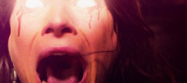
ALPHA STILES GIF TUTORIAL
ALPHA STILES GIF TUTORIAL
Another one? So soon? Yeah, well I originally made a werewolf!Allison gif tutorial, and it kind of sucked. So I revamped it for just a color porn gif tutorial and now I am making a much better werewolf eyes tutorial. Featuring the glorious and badass Alpha Stiles. Also, it’s the top gif from my most recent post.
MUST HAVE: knowledge of Photoshop and adjustments and of course know how to make gifs. This isn’t a super difficult tutorial, but it does require a lot of time and patience.
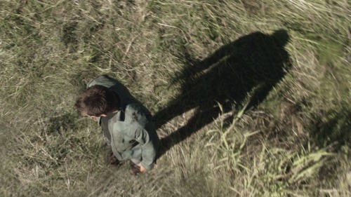
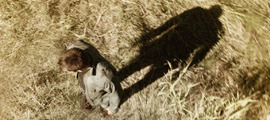
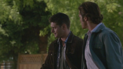
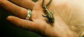
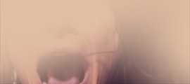
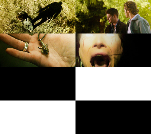
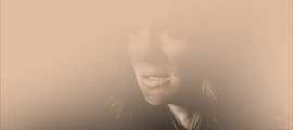
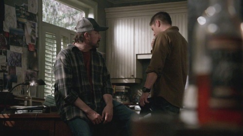
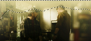
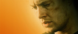
I will be showing all of you non-beginners, how to turn this:

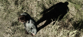
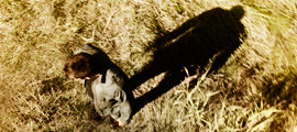
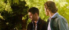
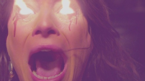
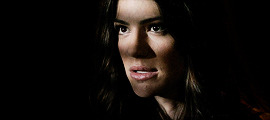
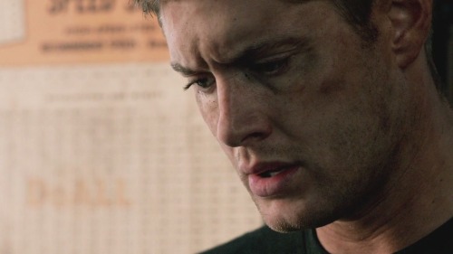
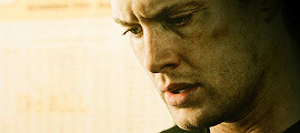
into this:

First step, I extended the background. The end size should be 500 x 220, and you should be cropping to get rid of some of the top and bottom parts.

The white on the right side is blank space because I moved the layers over.
Next I picked a color from the background, for the background. It’s much easier to do it this way and then manipulate the color of the BG later on using adjustment layers. Make a new, blank layer and start filling in the right hand side with a round soft tipped brush. The color I used is #d2ccb4.

Looking good right? I ended up with four layers for the background coloring alone by the way. So don’t be afraid to use a few.
Next some actual toning and coloring. I almost always start with a black and white gradient layer, set to the soft light blend mode. I kept the opacity at 100% for the contrasting.

I actually duplicated that gradient, and put the opacity to 14% on the copy.
Now a curves adjustment, output 143 and input 93. And selective color to mess with the background coloring. Focusing on Whites; the settings are cyan -1, magenta -8, yellow -9, black +15, set to absolute.

More selective color! This time, reds and yellows. Reds, cyan -13, magenta +10, yellow 0, black 0. Yellows, cyan -28, magenta -24, yellow -31, black -52. Set to relative, instead of absolute this time. I also added a black focused selective color, +4 on blacks and nothing else.

I wanted to make the reds pop in this gif, so I made another selective color but this time I masked it only for his shirt. Reds, cyan -100, magenta +100, yellow +100, black +100. Set to absolute.

Yet another, selective color. Yellows, cyan -10, magenta -18, yellow -37, black 0. Relative setting; Cyans, cyan -38, magenta -7, yellow 0, black 0. Neutrals, cyan -8, magenta -12, yellow -12, black 0.

Make another selective color, separate from the last one; again focusing on Whites & Cyans. For the Whites, cyan -8, magenta +3, yellow +10, black 0; absolute setting. Cyans, cyan -100, magenta -100, yellow -100, black 0.
I made another selective for the blacks again and masked it for the left side of his face. Adding deeper shadows and more contrast overall. (Black +12)

Next a vibrance adjustment; vibrance +11, saturation +18. Another selective color; Reds, cyan -12, magenta +15, yellow +17, black -20. Set to absolute. And another curves; output 126, input 109.
A subtle color balance next; 0, -3, +3. Another selective color; Reds, +10,+6,+5,0. Hue and saturation, 0,-7,0.

So far so good!
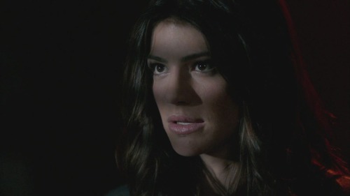
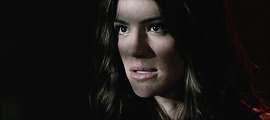
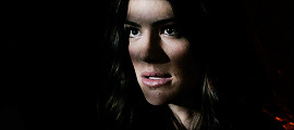
I love the coloring as is, but now it’s werewolf time. I used this screencap from season 4, because the eyes are perfect for what I was planning. (the link is too a cropped and lighter version of the one below)

Make sure to color the image first, before copying and pasting the part of the eye you need! I used a few layers to do this, some curves and a gradient. After I changed the coloring it looked something like this:

Now using the lasso tool, I circled and copied the left eye and pasted it as a new layer onto the gif of Stiles.

Now select the very first frame of the gif, and make a new group. I just called it EYES. Then paste in the eye layer and transform (ctrl+t) it down until it’s the right shape and size for Stiles’ eye. I started with the right eye, just because it was less shadowed and easier to place.
You may need to erase parts of the eye layer; don’t be afraid to do so, but be careful not to get rid of too much.
DO NOT MERGE THE LEFT AND RIGHT EYE LAYERS! Just don’t, it will make everything so much harder and it won’t look as good in the end either.

Duplicate the layer for the eye and place the other one over the other eye.
Now the first frame is good to go, but if you play the gif you will notice only the first one has the eyes. Or, all of them do, but on the other frames the eyes aren’t where they should be. So the cool and easy thing about this, is that you can go to frame 2, then click the layers and move them how you need them. Then go back to frame 1 and they didn’t move!
Keep doing that until you can’t anymore, which for me was frame 10 when he starts to blink and look down. With that one, go to the eye layers for the red eyes and duplicate them both.
Now, I named the layers, left and right just to make it easier on myself, and I suggest you do the same. So I ended up with 38 eye layers, all duplicates and you will probably end up with about the same amount. There is a method to the madness though.
Basically with the closing eyes parts I needed to duplicate the original layers so I could erase the top parts of the eye layer. That way it’s not overlapping on his lids.

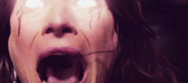
Here is a super slow down to show you just how natural it looks. ^^
If you just tried to move the layers like before it would have worked, but you would try to erase the top parts of the eye to make it look better and it would erase those parts on every frame. Not good. So make sure to duplicate as needed and keep the eyes for the next 30-ish frames as separates so you can and make sure to manipulate the parts you need to without screwing the other frames over.
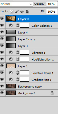
I always, ALWAYS save the PSD and of course sharpen. Best way to do this, and the fastest way, is to press the three line thing in your frames box (upper right corner, it’s a drop down) and convert to timeline. Then select all your layers, right click and convert to smart object; then filter > smart sharpen. Amount > 500, Radius 0.3, Remove gaussian blur, and make sure the More Accurate box is ticked.

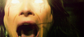
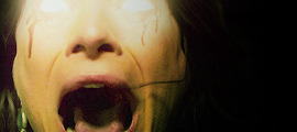
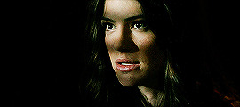
A lot of time and effort later and you’re done! I’d say the end result is worth all that time wouldn’t you? As always, here is the PSD DOWNLOAD, and more examples of the werewolf eyes below:


-
 silkwhawk liked this · 5 years ago
 -
 novastral liked this · 6 years ago
 -
 klauswalz reblogged this · 6 years ago
 -
 klauswalz-resources reblogged this · 6 years ago
 -
 chambersofthesea liked this · 6 years ago
 -
 ashieemichelle reblogged this · 6 years ago
 -
ashieemichelle liked this · 6 years ago
-
 streakofmadness liked this · 7 years ago
 -
 riderflynns liked this · 7 years ago
 -
 blackthorndryad liked this · 7 years ago
 -
 borutous-blog liked this · 8 years ago
 -
 inejqhafa liked this · 8 years ago
 -
 thistlespringsummer liked this · 8 years ago
 -
 ulric-nyx liked this · 8 years ago
 -
 nekrofilth liked this · 8 years ago
 -
 timetraveldean liked this · 8 years ago
 -
 choconoctis liked this · 8 years ago
 -
 huimangi reblogged this · 8 years ago
 -
 katherinehoughtoncastle47 liked this · 8 years ago
 -
 navarrohaash-blog liked this · 8 years ago
 -
 inthenameofloveforthesakeofpower liked this · 8 years ago
 -
 striveforgreatnessss liked this · 8 years ago
 -
 17px reblogged this · 8 years ago
 -
 linzihong liked this · 8 years ago
 -
 renaisnce liked this · 8 years ago
 -
huimangi liked this · 8 years ago
-
 impala-moose liked this · 8 years ago
 -
 aryasstark liked this · 8 years ago
 -
 tvtvtvyay reblogged this · 8 years ago
 -
 fluffy-jack-blog liked this · 8 years ago
 -
 joey-prue liked this · 8 years ago
 -
 anissa-pierced liked this · 8 years ago
 -
 charmful-ly liked this · 8 years ago
 -
tvtvtvyay reblogged this · 8 years ago
-
 jugheadzarchive liked this · 8 years ago
 -
 skyqueen3 liked this · 8 years ago
More Posts from Lycaens
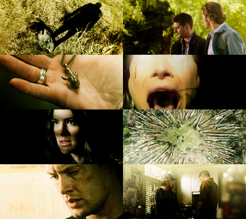
SCREENCAP PICSPAM TUTORIAL
Yes, another tutorial! This was a request from an anon; they wanted a tutorial of how I did this Supernatural Picspam, and I am going to actually do it, because I actually like making tutorials ^_^ So just to be clear, I will not be doing the exact same pictures and color scheme because I didn’t save the PSDs for each of those pictures, but it will be pretty much the same.
I am showing you how to make a color-scheme picspam, made entirely of screencaps from Supernatural:

First thing you need is a template. There are plenty you can find online to download, especially on tumblr; but I am going to give you one for this spam.
I use different templates for each picspam I make, and for the original post I used the picture sizes above and made it for sixteen pics instead of the eight I am doing right now.
For this kind of picspam I usually either cap my own screencaps from HQ videos that I have of episodes, or I get them online. For these caps I used homeofthenutty.com, and the episode I took the caps we are using for the tutorial is season 4, episode 1.
Now, open up the first cap you’re going to use:
First things I usually do are to duplicate the background layer; set the blend mode to screen and mess with the opacity until I find a lightness I like. Then I made a black and white gradient map, set the blend mode to soft light, and the opacity remains at 100% for this one.
Now a selective color, focusing on reds. Cyan -34, Magenta -29, Yellow -12, Black 0. Now make a new layer, blank and pick a round soft brush and a color. This color will define the color scheme for the whole picspam, so pick something good.
I made a duplicate of the layer and erased some of the middle parts I colored before. I used this #e0bea3 for both layers, and set the blend mode to soft light.
Now make a Hue/Saturation adjustment layer, with saturation +24. Then a Vibrance adjustment, vibrance +16 & saturation +11.

Download those and add them on top of the cap. The first one should have a blend mode of soft light, and an opacity of 38%. The second is also soft light, but 100% opacity. Now another black and white gradient map; soft light blend, 95% opacity.
Lastly, I stamped the layers (ctrl+alt+shift+e) and sharpened. Filter > Sharpen > Smart Sharpen, then make sure that More Accurate is ticked, Amount 500, Radius 0.3 and Remove: Gaussian Blur. And then a color balance if you need it, just for more toning. I used midtones only, -9, +22,+22.
Then add it to the template. And rinse and repeat.
Here are my layers for this cap, and the results:
This one ^^ required some more toning and darkening than the others.
I started with the darkening and contrasting. A black and white gradient map set to the soft light blend mode. Then another at a lowered opacity, then a selective color, focusing on reds. -34,-29,-12,0; set to absolute.
Then a new blank layer, the same yellow-orange tone as before (#e0bea3) This was how I colored it:
Then set the blend mode to, guess what? Yeah, soft light. Did a hue/saturation and a vibrance layer, just like on all the other caps. And the gradient layers I told you to download from before. Now it looks like this:
Now for the real trick, making it yellow/green without making it look terrible. Make a color balance adjustment, midtones only; -47, +31, -30. Then another one, only midtones again; -17, +12, -31.
Then I stamped (ctrl+alt+shift+e) and sharpened, same as before. Then I added a blank layer and painted in black on the right side, and added a subtle curves layer on top.
And add it into the template!
Looking good so far ^^
Ruby’s cap was different too; for her I duplicated the background layer and set the new duplicate to the blend mode screen. Then I stamped it and sharpened. Next a gradient map, soft light black and white color scheme.
I wasn’t happy with the contrasting so I duplicated the gradient one more time. And I did some toning; just a vibrance and some selective color.
Next the famed soft light color layer.
And then the same gradients as before and some black for the right side too.
I did another vibrance, (+38,+10) and a color balance (midtones: -17,+15,-10) and a selective color (reds: -32, +36, +35, 0)
Final result ^^
This one I just duplicated the background and set the duplicate to screen. A vibrance layer, a color balance for more green, and then sharpened it.
Follow all steps from the first picture; this time I added a blank layer on top and used a yellow-green color for the top part. I wanted there to be a lot of light; here is my selection for where I put the color (#e2d5a0)
Color balance and gradient maps are your best friends!
Same steps as before! Only this time, I used an extra color layer (#e17813) I placed the coloring like so:
Blend mode = screen, Opacity = 44%.
Hue and saturation, vibrance then the same gradient layers we’ve been using all along.
I added another gradient map on top for some more contrasting; soft light blend mode and 43% opacity. Then I used blank layers, a soft brush and absolute black to add some darkness to the right side. Then a color balance on top of everything for the green-yellow tones of the picspam’s color scheme.
That’s it! Now add them to the template if you haven’t already and save it.
At the very end, I did add a vibrance and a selective color on top of all of the layers on the template. Vibrance +11, +3; Selective Color, blacks +5.
No PSDs this time, but for more screencap editing help check out my other tutorials. Especially the one I did for Sam.
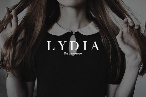
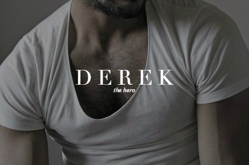
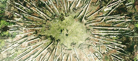
teen wolf original squad & name meanings (insp.)
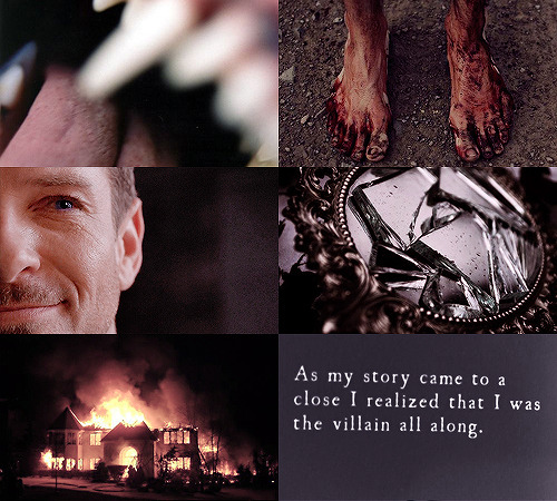
TEEN WOLF || peter hale
I'm not the bad guy here.


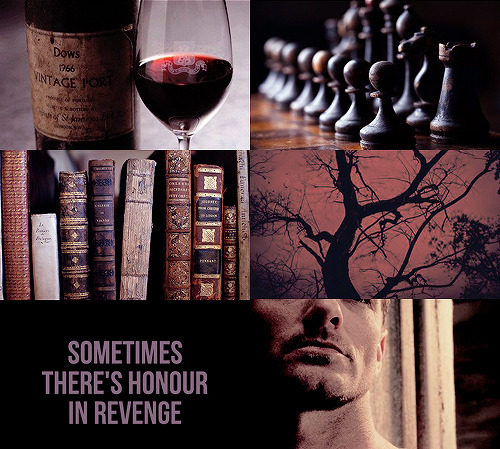
aesthetics series ◇ elektra natchios
Hi, it's the previous anon here, I would honestly love a tutorial, but unless you don't do all your aesthetic posts the same way, I guess you can make the tutorial on any one of them. I do have this link that I was also really interested in knowing how you made; "lycaens-tumblr-com/post/149468976315/disconnected" (replace - with .) thank you!
Well I did do a tutorial of the SPN picspam here. That should help you with aesthetic picspams since a lot of those pictures needed some serious toning to fit in with the color scheme. If that’s not good enough I can make a more complex aesthetic spam tomorrow probably. Been meaning to make one anyway.
****Here is the aesthetic tutorial.
And here is the tutorial for the Disconnected graphic/gif.