aka @rmgrey-author | Rowan Grey • writer • graphic artist • mix maker • tutorial maker • ABSOLUTE STEREK TRASH • multiship af
441 posts
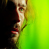
ICON TUTORIAL #1
ICON TUTORIAL #1
I decided to show you how I make some of my icons; most of the time I make them by just cropping my own edits. But sometimes I make colorful icons for no reason, so, that’s what we’re doing.
PROGRAM: Photoshop CS6, DIFFICULTY: Medium
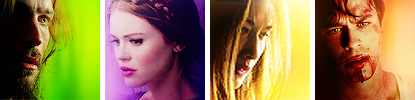
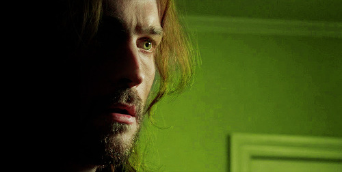
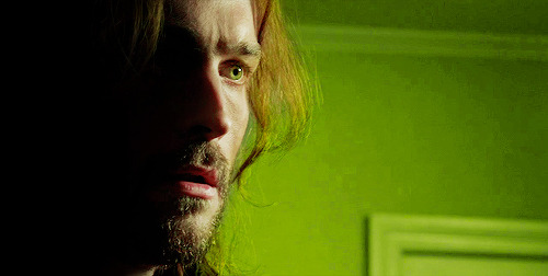
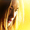
To be clear, I am showing you how to make icons like these:
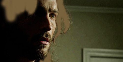
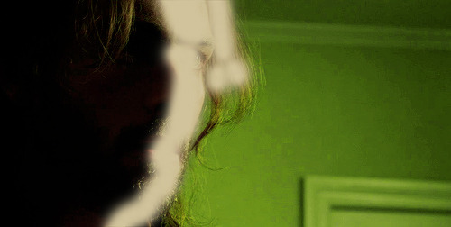
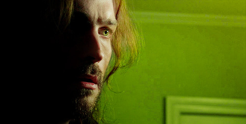
First things first, open up your screencap your turning into an icon.
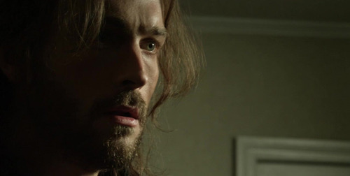
I am starting with Ichabod from Sleepy Hollow.
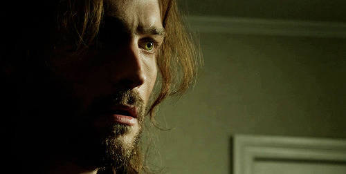
Duplicate the background layer and sharpen the image. I always use Filter > Sharpen > Smart Sharpen, with the Amount set to 500, the Radius as 0.3, More Accurate and Remove Gaussian Blur.
Add a Brightness/Contrast adjustment, with the brightness as 43 and contrast 16. Then a Curves; 152, 140. I added a Levels just to dull the brightness a little; 0, 1.00, 255 then output levels 0, 229. Lastly, for more contrasting I went with a Selective Color adjustment blacks +8.
Now I focus on his eyes. I wanted the colors be more vibrant and noticeable; so I created a new blank layer and grabbed a pale green color (#746e48), set the blend mode to soft light and painted in his iris. I selected the layer and right clicked to ‘select pixels’ and added a Curves; 150, 105.
Now make another blank layer and with a soft round brush, use a brown color to paint his hair (#78613d).
Paint where I did ^^^
Then set the layer to soft light blend mode, at 74% opacity.
Next I do some toning for the entire image. Color Balance, midtones only: +10, +13, +1. Selective Color; REDS, -39, +54, -11, 0. Then make a whole new Selective Color and mask it so this one doesn’t touch his face and barely grazes his hair. YELLOWS, -23, -42, +57, -10.
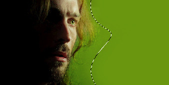
Make another Selective Color that is not attached to the one you just did. This time I colored the whole image and then went back over with a lower opacity brush and got rid of SOME of the coloring on his face. Just some of it.
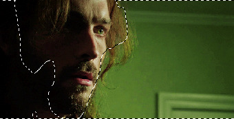
Above is what my selection looked like, and here are the Selective Color settings: YELLOWS, +42, -40, +85, 0. Then another Selective Color, for more YELLOWS, -8, -42, +38 with the selection of the previous selective color. Also on this one you want to do these GREENS, -55, -37, +100, 0.
Next, make a new blank layer; using this color #d1c39b color like so:
Soft light blend mode, 71% opacity.
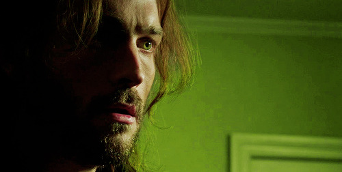
Another Selective Color, YELLOWS, +31, +31, -26, 0; make sure it’s masked only for his face! It shouldn’t touch the background this time.
Next I wanted to shade the left side, so I used a black brush on a new blank layer; then a gradient fill and painted in more on the side.
Next another Curves, 138, 112. Vibrance, +16, +5.
Add both of these:

Blend modes should both be soft light!
Next we edit the background! Make a new layer, and get a nice vibrant green color (#6e9700) then use a soft brush to color the right side of the image.
Above is my selection. Keep the blend mode and opacity at default for this one.
Rinse and repeat, only this time use this color #93be1e; and make sure the blend mode is soft light and the opacity is 70-76%. I duplicated the layer and erased a lot of the color near Ichabod; keeping the more vibrant greens near the edges of the image.
Lastly, I stamped the layers (ctrl+alt+shift+e) and added one more Selective Color. REDS, -28, +29, +30, 0; and another Vibrance, +10, +2.
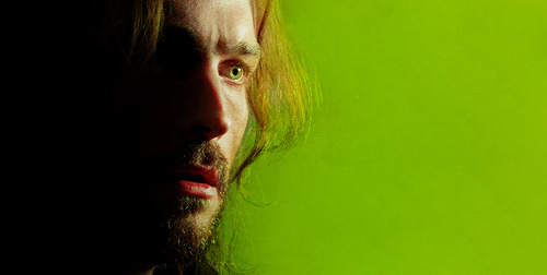
Then crop it! I make my icons 100x100, and then usually sharpen the image again. For the final step I did add a texture:
I set it to soft light, and lowered the opacity to about 80%. I also erased the parts of the texture that overlapped on Ichabod’s face and hair.
See how the texture adds some definition to the background, and makes everything pop? If you have trouble finding good light leaks and icon textures, I definitely recommend midnight_road.
++
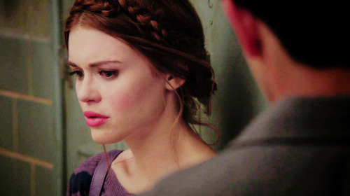
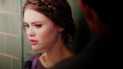
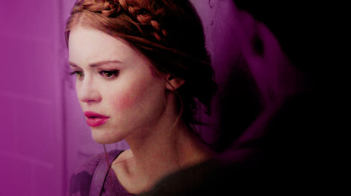
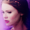
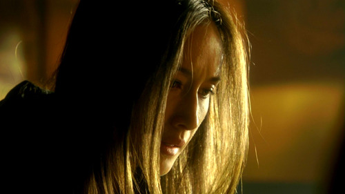
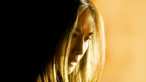
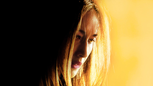
Now onto the Lydia icon, open up this cap:
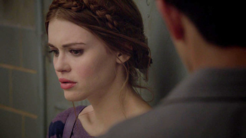
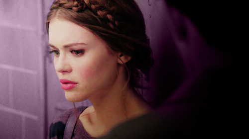
Start with a duplication of the background layer, and set the duplicated layer to screen for the the blend mode. Then add a Brightness/Contrast adjustment; brightness 24, contrast 16. Then another of the same adjustment, this time brightness at 34, no change in contrast.
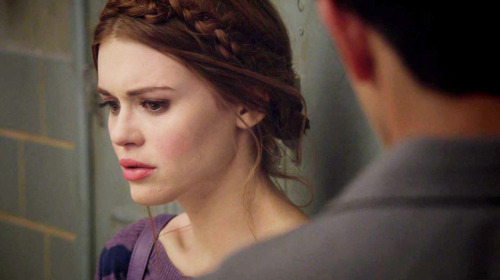
Now a Curves, output at 152, input at 140. And a Levels, top row 0, 1.00, 255; output levels, 0, 229. And a Selective Color, BLACKS +32.
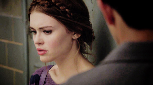
Next some toning; Color Balance (midtones), +10, +13, +1. Selective Color next, REDS -39, +54, -11, 0. And a Vibrance; vibrance +16, saturation +5.
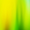
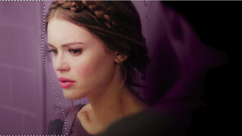
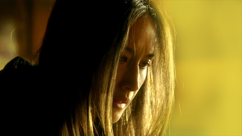
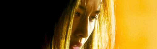
Now add in the gradients! Save the two images below:


And add them onto the cap. I did duplicate the first one three times; and of course all of them are on soft light blend mode 100% opacity!
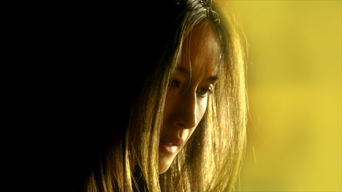
Next I started on the coloring; first make a blank layer and grab a brush. I used a round brush at 50% hardness and a nice deep purple color to paint in the left side background (#5c3955). Then I set the blend mode to color; after that make another layer and do the same for the other half of the image.
I made another blank layer, blend mode normal, opacity 65%. And I used a very soft round brush at about 40% painting opacity to add in some more purple on the left side.
Add yet another blank layer, this time set the blend to soft light, 55% opacity and paint with a soft brush on both sides of the image. (#a45494). One more blank layer using the same color, normal blend mode 72% opacity and very lightly paint some on the left side again.
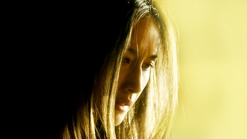
Now a Selective Color, REDS +26, +12, -1, 0. YELLOWS -79, -19, -55, 0. MAGENTAS -75, +11, -50, 0. This really brings out the pinks and purples, and tones her skin some more.
Now a Vibrance, +24, +12. For this vibrance adjustment layer, I masked it so it didn’t touch most of Lydia’s face. I kept the vibrance for her hair, lips, eyes and blush.
I added another BLACK focused Selective Color (+9), and messed with her lips too. MAGENTA +68, +73, +54, +51. Then another Selective Color, BLACKS +18, and I masked it for just her eyes, and only colored the lashes and eyelids.
I did add a blank layer, blend mode overlay at full opacity and used a light green to color her irises. (#919952). Then a Curves; output 130, input 99, and masked for her irises only. Then another Curves; 144, 79, this one for the reflections in the eyes. And lastly a Hue/Saturation, -31, for the whites of her eyes.
Last for the toning, hair! New blank layer again, soft light blend mode, 79% opacity. Use this color #d4a783, and color her hair with a soft round brush.
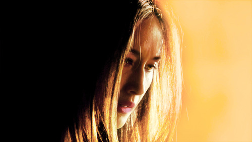
Now make an icon; just make a new canvas sized 100x100. Then stamp the Lydia cap (ctrl+alt+shift+e) and move it over to the small canvas. Use Ctrl+T to transform the image so you can resize it how you want. This is how I did mine:
Add a Selective Color, BLACKS +42 to deepen the blacks. I also added a gradient map (black and white) at a soft light blend mode and 27% opacity. Just for simple blending/contrasting.
Save this image texture:
And add it to the icon. I set the blend mode to soft light, opacity 40%; and then I flipped it vertically.
For this one, screen blend mode, 61% opacity. I flipped it horizontally and erased most of the middle part of the texture using a soft round brush at a lowered opacity.
This one, set the blend mode to screen, 80% opacity. I flipped it horizontally and used ctrl+t to move the lightest part of the texture into the bottom left corner angled upward at Lydia’s jaw.
I also added another Vibrance, +7 and +12. Then stamped the layers and sharpened with the same settings as the Ichabod icon above. Filter > Sharpen > Smart Sharpen, with the Amount set to 500, the Radius as 0.3, More Accurate and Remove Gaussian Blur.

++
Open up this cap of Nikita:
I liked the brightness and contrast of the cap already, so I started by making a new blank layer and taking a light yellow color to paint in the right side background. (#dfc83b) I used a soft round brush, at varying opacities to color that side in.
I then made another blank layer and colored the left side background in with absolute black.
Next add a Gradient Map (black to white) with the blend mode set to soft light, and the opacity at 73%. Then a Curves adjustment, output 150, input 103. And a Levels, 0, 1.42, 255; output levels 0, 255.
Now some more toning; Selective Color, REDS -52, -40, +62, +43. Absolute not relative; also make sure to mask the adjustment so it doesn’t touch Niki’s face. Make another Selective Color, also masked so it only effects the background. These settings: YELLOWS +6, +68, +57, -17. Also set to absolute.
I also added a Vibrance adjustment; vibrance +27, saturation +26.
Now add a blank new layer, this color #dfc83b and set the blend mode for the layer to soft light. I used a soft brush to paint her lips. Then a Curves, 160, 94; and masked it to color her irises. I did the same thing for the reflections in her eyes.
I also added another Selective Color, REDS -18, +40, -12, -38 (absolute). BLACKS 0, 0, 0, +100. Another Selective Color, YELLOWS -18, -5, -40, 0 (absolute).
My final touches were to add two Gradient Fills; the first is black angled from the left to the right. These are my settings:
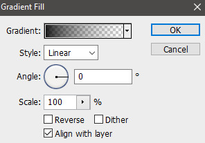
I masked this for only the left side.
The second one is for the entire image; and the blend mode is soft light, 100% opacity. And finally, stamp and sharpen.
Great cap edit for a picspam, but this is an icon tutorial. So make a new canvas like before, 100x100 and add the stamped Nikita image. All I did with the icon was add a blank layer and some light in a soft yellow color with a light opacity brush.
I also sharpened it again!
++
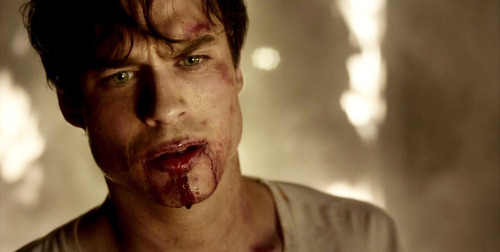
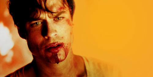
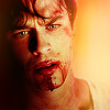
First duplicate the cap of Damon, set the blend mode to screen. Now a Brightness/Contrast, 24 and 16. Another Brightness/Contrast, brightness at 34. Now a Curves, 152 and 140. Levels, top row all default and the output levels, 0, 229.
I added a Selective Color too, BLACKS 0, 0, 0, +8.
Now some toning; Color Balance (midtones), +10, +13, +1. Selective Color, REDS -39, +54, -11, 0.
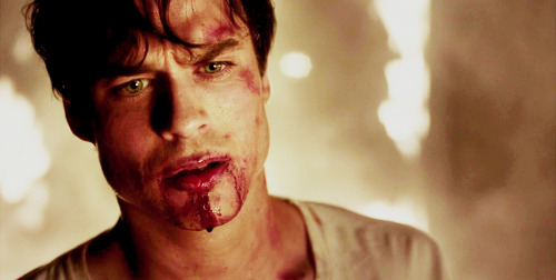
Now the background! Make a Selective Color, REDS -70, +100, -56, 0. YELLOWS -100, +100, -9, +98. And mask the adjustment to only effect the background. Use the same masking selection to create another Selective Color, REDS -59, +19, +65, +56. YELLOWS -19, -100, -96, 0. MAGENTA -79, -25, 0, 0. One more time, same selection and another Selective Color; REDS -47, -9, +40, 0. YELLOWS -8, -42, +38, 0. GREENS -55, -37, +100, 0.
I made another Selective Color to maximize the oranges; REDS +1, -8, +66, 0 (absolute). I masked it to color basically everything, but erased some color from Damon’s face and neck.
Now add a Curves 138, 112; and a Vibrance +16, +5.
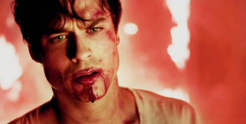
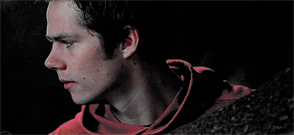
Use the same two Gradients as before:


Both set to soft light blend mode and 100% opacity. And the first image needs to be reversed, the light on the right and the dark of the left.
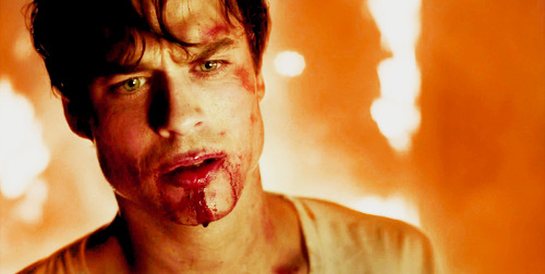
I made a bunch of blank layers and used them to make some changed to the background. I used this color on the first two #f0a334, and colored the right side in.
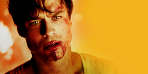
Then mask a Color Balance to only effect the right side: settings for midtones (only) +22, 0, +73. I then made more blank layers and used this orange #eea036, to color in the background the rest of the way on the right side.
I did add a black and white Gradient Map, soft light blends mode at 20% opacity.
I then stamped the image (ctrl+shift+e+alt) and moved the stamped image over to the left.
I made a new blank layer, used a very soft round brush and filled in the left side of the background that remained (#000000).
Now a few more things for toning; Selective Color, REDS -14, -6, -10, 0. YELLOWS -4, -20, -48, +14. Then another Selective Color, YELLOWS -17, +30, -45, 0. And one last Vibrance, +27 and +10. Now Sharpen!
Now make the canvas, 100x100 and drag the stamped Damon layer over. Add this texture:
Blend mode to soft light, opacity at 100%. I also erased the middle section of the texture, to avoid overlapping Damon’s face.
This one, I flipped around a bit to find the right angle, and set the blend mode to screen and the opacity to 63%. Then erased the middle parts again.
And finished; wow that was a long tutorial. Hopefully it helps you create cool icons!
-
 pleboth liked this · 1 year ago
 -
 fujikoi liked this · 1 year ago
 -
 orphancains reblogged this · 1 year ago
 -
 bruelarson liked this · 1 year ago
 -
 a-carnie-and-a-cop liked this · 1 year ago
 -
 midnightresource reblogged this · 1 year ago
 -
 isabellasaintelyon liked this · 1 year ago
 -
 myusefullstuff reblogged this · 1 year ago
 -
 logicheartsoul liked this · 1 year ago
 -
 dobrienpsd reblogged this · 1 year ago
 -
 orion-lake liked this · 1 year ago
 -
 onewingedangels liked this · 1 year ago
 -
 dailyresources reblogged this · 1 year ago
 -
dailyresources liked this · 1 year ago
-
 nolanhollogay reblogged this · 2 years ago
 -
 psblogtips reblogged this · 4 years ago
 -
 xtinahhx liked this · 6 years ago
 -
 bizcochoz reblogged this · 7 years ago
 -
 kinarandomness liked this · 7 years ago
 -
 angrybonny liked this · 7 years ago
 -
 morgancoless liked this · 7 years ago
 -
 binariesuns liked this · 7 years ago
 -
 silverstarsabove liked this · 8 years ago
 -
 nightbloodxfeyre liked this · 8 years ago
 -
 fellciahardy reblogged this · 8 years ago
 -
 aurorharry liked this · 8 years ago
 -
 windsorwales liked this · 8 years ago
 -
 aki-koto liked this · 8 years ago
 -
 padmcnaberrie liked this · 8 years ago
 -
 wanhxdas-survival reblogged this · 8 years ago
 -
 hellacioushag liked this · 8 years ago
 -
 whatisyourchildhoodtrauma liked this · 8 years ago
 -
 gonercelo reblogged this · 8 years ago
 -
gonercelo liked this · 8 years ago
-
 pastelrainbowsky liked this · 8 years ago
 -
 fire-gift liked this · 8 years ago
 -
 aryasstark liked this · 8 years ago
 -
 fluffy-jack-blog liked this · 8 years ago
 -
 favereblog reblogged this · 8 years ago
 -
 psdhampirs liked this · 8 years ago
 -
 orcwiki reblogged this · 8 years ago
 -
 banelights liked this · 8 years ago
 -
 magsalecs reblogged this · 8 years ago
More Posts from Lycaens


aesthetics series ◇ elektra natchios
ALPHA STILES GIF TUTORIAL
Another one? So soon? Yeah, well I originally made a werewolf!Allison gif tutorial, and it kind of sucked. So I revamped it for just a color porn gif tutorial and now I am making a much better werewolf eyes tutorial. Featuring the glorious and badass Alpha Stiles. Also, it’s the top gif from my most recent post.
MUST HAVE: knowledge of Photoshop and adjustments and of course know how to make gifs. This isn’t a super difficult tutorial, but it does require a lot of time and patience.
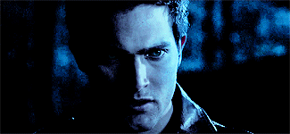
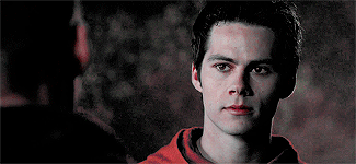
I will be showing all of you non-beginners, how to turn this:

into this:

First step, I extended the background. The end size should be 500 x 220, and you should be cropping to get rid of some of the top and bottom parts.

The white on the right side is blank space because I moved the layers over.
Next I picked a color from the background, for the background. It’s much easier to do it this way and then manipulate the color of the BG later on using adjustment layers. Make a new, blank layer and start filling in the right hand side with a round soft tipped brush. The color I used is #d2ccb4.

Looking good right? I ended up with four layers for the background coloring alone by the way. So don’t be afraid to use a few.
Next some actual toning and coloring. I almost always start with a black and white gradient layer, set to the soft light blend mode. I kept the opacity at 100% for the contrasting.

I actually duplicated that gradient, and put the opacity to 14% on the copy.
Now a curves adjustment, output 143 and input 93. And selective color to mess with the background coloring. Focusing on Whites; the settings are cyan -1, magenta -8, yellow -9, black +15, set to absolute.

More selective color! This time, reds and yellows. Reds, cyan -13, magenta +10, yellow 0, black 0. Yellows, cyan -28, magenta -24, yellow -31, black -52. Set to relative, instead of absolute this time. I also added a black focused selective color, +4 on blacks and nothing else.

I wanted to make the reds pop in this gif, so I made another selective color but this time I masked it only for his shirt. Reds, cyan -100, magenta +100, yellow +100, black +100. Set to absolute.

Yet another, selective color. Yellows, cyan -10, magenta -18, yellow -37, black 0. Relative setting; Cyans, cyan -38, magenta -7, yellow 0, black 0. Neutrals, cyan -8, magenta -12, yellow -12, black 0.

Make another selective color, separate from the last one; again focusing on Whites & Cyans. For the Whites, cyan -8, magenta +3, yellow +10, black 0; absolute setting. Cyans, cyan -100, magenta -100, yellow -100, black 0.
I made another selective for the blacks again and masked it for the left side of his face. Adding deeper shadows and more contrast overall. (Black +12)

Next a vibrance adjustment; vibrance +11, saturation +18. Another selective color; Reds, cyan -12, magenta +15, yellow +17, black -20. Set to absolute. And another curves; output 126, input 109.
A subtle color balance next; 0, -3, +3. Another selective color; Reds, +10,+6,+5,0. Hue and saturation, 0,-7,0.

So far so good!
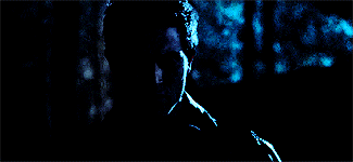
I love the coloring as is, but now it’s werewolf time. I used this screencap from season 4, because the eyes are perfect for what I was planning. (the link is too a cropped and lighter version of the one below)

Make sure to color the image first, before copying and pasting the part of the eye you need! I used a few layers to do this, some curves and a gradient. After I changed the coloring it looked something like this:

Now using the lasso tool, I circled and copied the left eye and pasted it as a new layer onto the gif of Stiles.

Now select the very first frame of the gif, and make a new group. I just called it EYES. Then paste in the eye layer and transform (ctrl+t) it down until it’s the right shape and size for Stiles’ eye. I started with the right eye, just because it was less shadowed and easier to place.
You may need to erase parts of the eye layer; don’t be afraid to do so, but be careful not to get rid of too much.
DO NOT MERGE THE LEFT AND RIGHT EYE LAYERS! Just don’t, it will make everything so much harder and it won’t look as good in the end either.

Duplicate the layer for the eye and place the other one over the other eye.
Now the first frame is good to go, but if you play the gif you will notice only the first one has the eyes. Or, all of them do, but on the other frames the eyes aren’t where they should be. So the cool and easy thing about this, is that you can go to frame 2, then click the layers and move them how you need them. Then go back to frame 1 and they didn’t move!
Keep doing that until you can’t anymore, which for me was frame 10 when he starts to blink and look down. With that one, go to the eye layers for the red eyes and duplicate them both.
Now, I named the layers, left and right just to make it easier on myself, and I suggest you do the same. So I ended up with 38 eye layers, all duplicates and you will probably end up with about the same amount. There is a method to the madness though.
Basically with the closing eyes parts I needed to duplicate the original layers so I could erase the top parts of the eye layer. That way it’s not overlapping on his lids.

Here is a super slow down to show you just how natural it looks. ^^
If you just tried to move the layers like before it would have worked, but you would try to erase the top parts of the eye to make it look better and it would erase those parts on every frame. Not good. So make sure to duplicate as needed and keep the eyes for the next 30-ish frames as separates so you can and make sure to manipulate the parts you need to without screwing the other frames over.
I always, ALWAYS save the PSD and of course sharpen. Best way to do this, and the fastest way, is to press the three line thing in your frames box (upper right corner, it’s a drop down) and convert to timeline. Then select all your layers, right click and convert to smart object; then filter > smart sharpen. Amount > 500, Radius 0.3, Remove gaussian blur, and make sure the More Accurate box is ticked.

A lot of time and effort later and you’re done! I’d say the end result is worth all that time wouldn’t you? As always, here is the PSD DOWNLOAD, and more examples of the werewolf eyes below:


Hi, it's the previous anon here, I would honestly love a tutorial, but unless you don't do all your aesthetic posts the same way, I guess you can make the tutorial on any one of them. I do have this link that I was also really interested in knowing how you made; "lycaens-tumblr-com/post/149468976315/disconnected" (replace - with .) thank you!
Well I did do a tutorial of the SPN picspam here. That should help you with aesthetic picspams since a lot of those pictures needed some serious toning to fit in with the color scheme. If that’s not good enough I can make a more complex aesthetic spam tomorrow probably. Been meaning to make one anyway.
****Here is the aesthetic tutorial.
And here is the tutorial for the Disconnected graphic/gif.


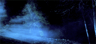
STEREK WEEK 2016: Day 4 - Magic!Stiles/Were!Stiles
After Stiles gets turned into a werewolf he struggles with control. The only thing that helps is physical contact with Derek.
TEEN WOLF AU || The Stilinski Pack AU
Derek Hale is a lone wolf looking for a pack that’ll help him take down the alpha that murdered his sister. He tracks a powerful scent to the woods and comes across an alpha werewolf he didn’t expect.